Parpro Consulting
A user-first redesign by Max, Audrey, Iris, & Aubrey
🔍 Case Study
📱 Mobile App
🎮 Game Design
🍎 Education
6 min read
My Role
Full Stack Designer
Brand Designer
Graphic Designer
Team
Max Lu
(Illustrator, Project Manager)
Iris D. Liu
(Storywriter)
Audrey Sum
(Illustrator)
Duration
2 Weeks
Tools
Figma
Figjam
Brief
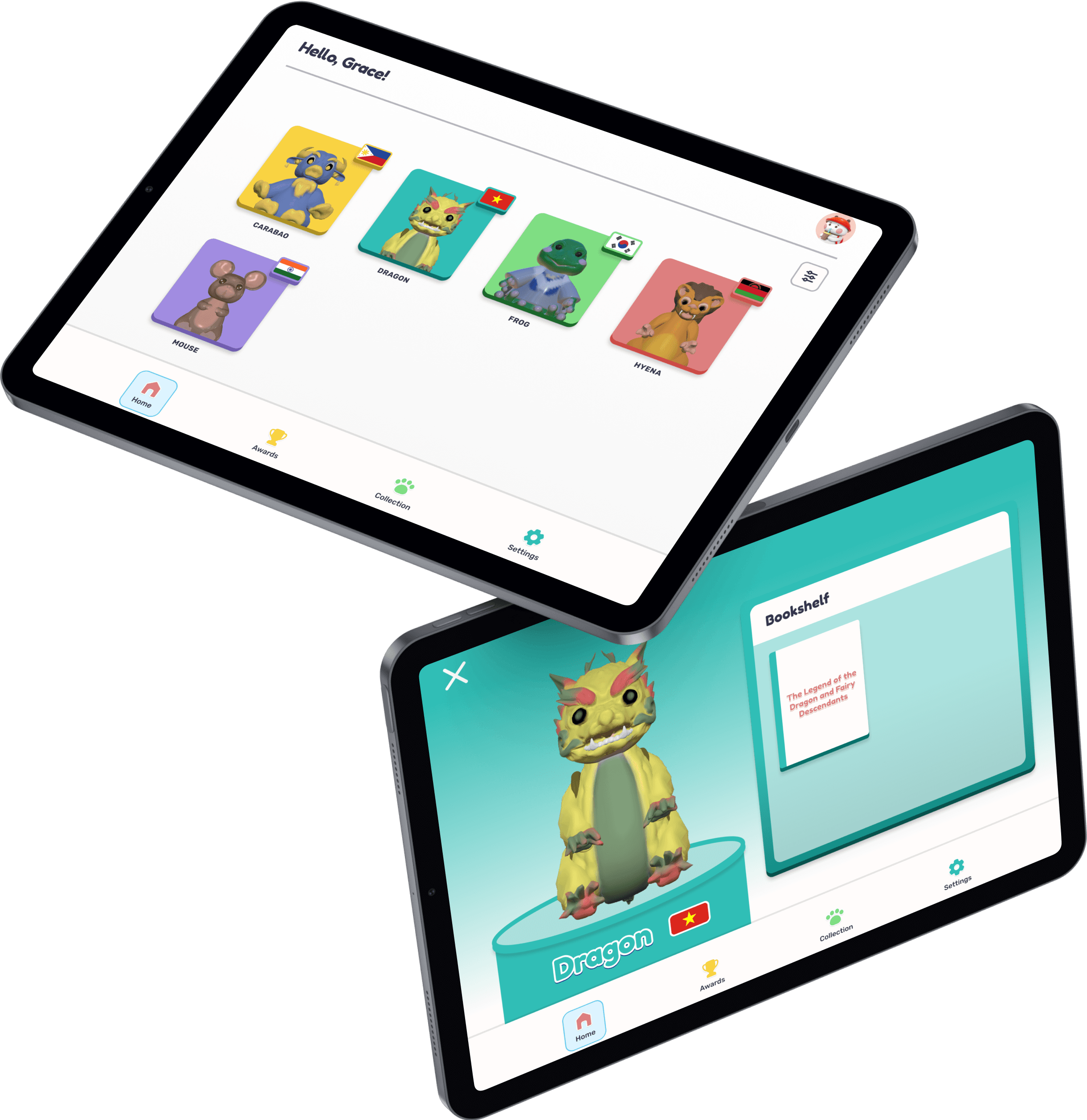
Folktale Friends is an app and toy figurine for children aged 3-12 years old that transforms traditional storytelling into an interactive storybook through lessons and mini-games. The app aims to promote problem-solving, literacy, curiosity, and adaption to digital learning while fostering an open-minded appreciation for diverse traditions and cultures.
jump to final prototype
2. Problem & Key Question
Problem & Key Question
Parpro's current website design suffers from a weak establishment of brand identity and a lack of uniqueness, which results in diminished bookings, reduced trust, and lower engagement levels.
Research Summary
Solutions Summary
Custom Elements: Less stock images makes the website look more trustworthy
Animations: Gives the website an immersive touch
Brand Redesign: Subtle changes to make the brand pop
Improved Layout: Informational hierarchy to draw the user’s eyes to what matters most
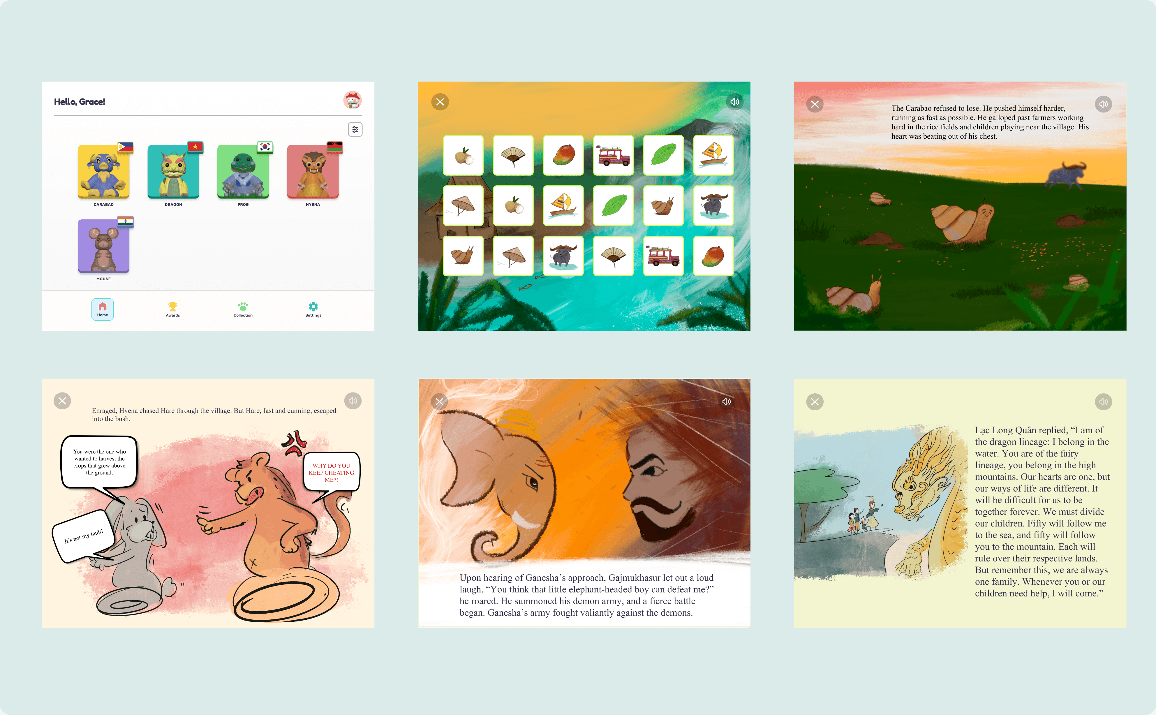
User Insights
User Personas

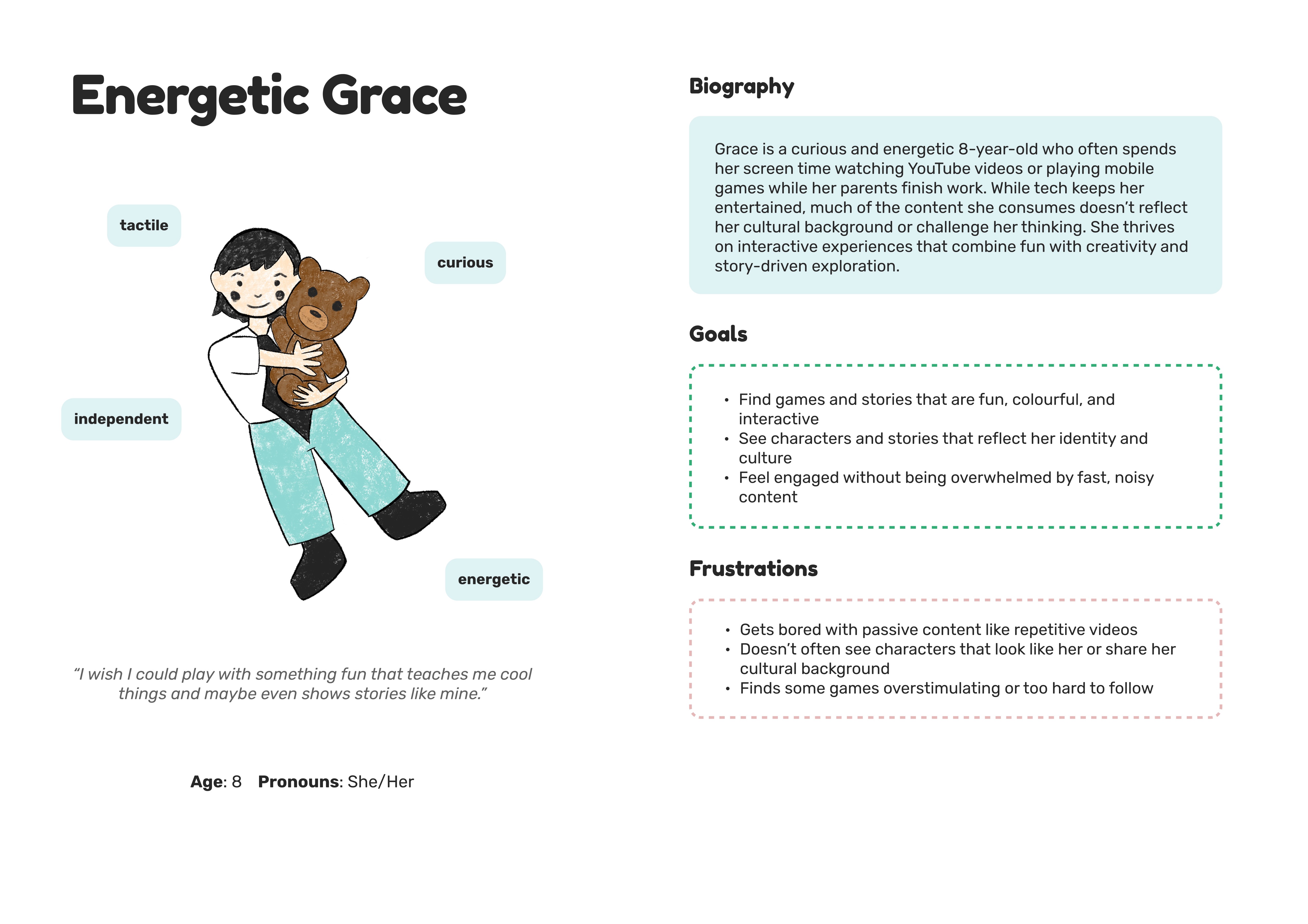
User Needs
Interactive Play
Combining tactile interaction and traditional play + storytime with digital engagement that is trustworthy and can hold attention without overstimulation.
Cultural Exposure
Media that reflect diverse cultural backgrounds, especially underrepresented ones, to support identity, inclusion, and learning.
Ease and Peace of Mind
A platform that’s safe, fun, and easy to manage, so care givers can feel confident about their children's playtime experience.
Solution

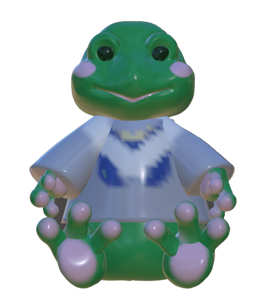
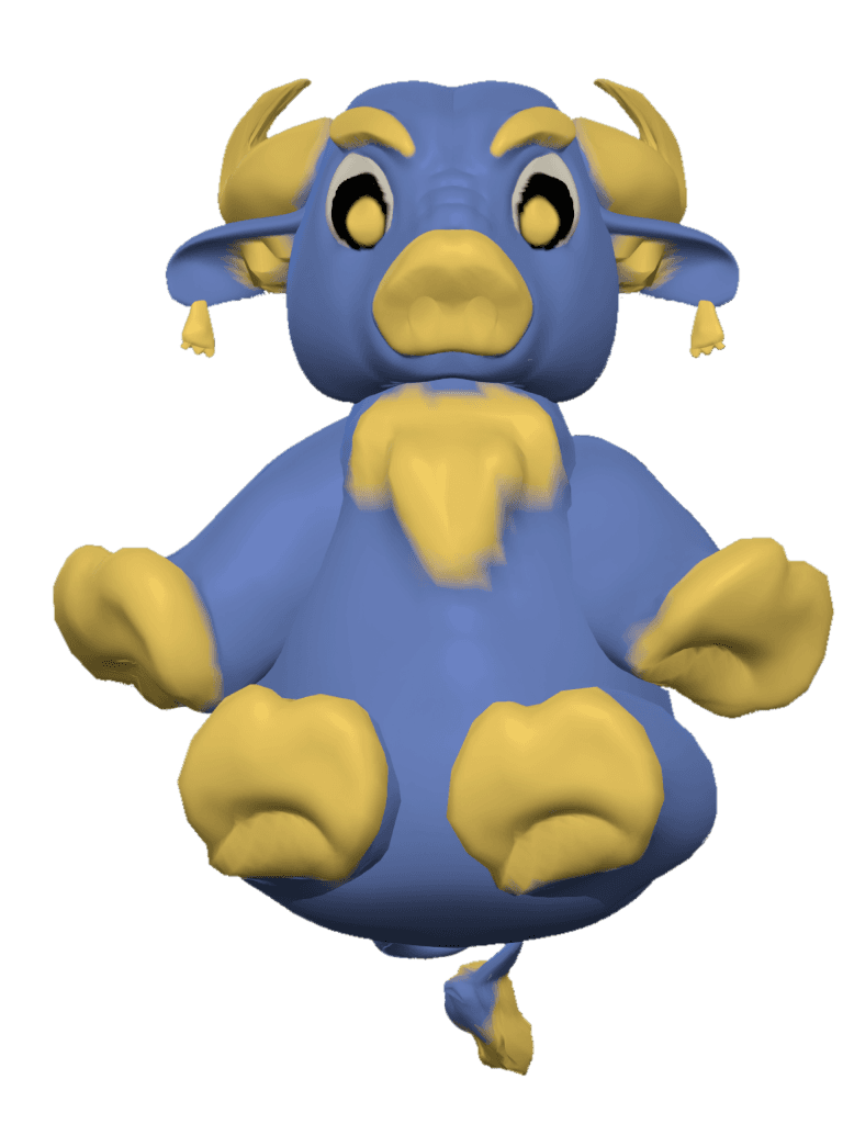
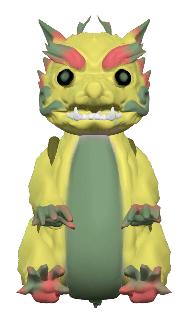
Folktale Friends is a hybrid toy-and-app experience that combines tactile play with interactive digital storytelling. Each animal figurine includes a scannable QR code linking to an illustrated folktale, complete with narration, cultural elements (foods, clothing, language), and mini-games like memory challenges and quizzes. By blending global stories with playful learning, the app fosters cultural awareness and active engagement in young children.
to navigate prototype
R
to restart
2
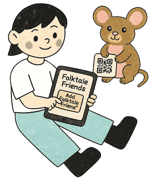
Use the app to scan the QR code included with your Folktale Friend.
3
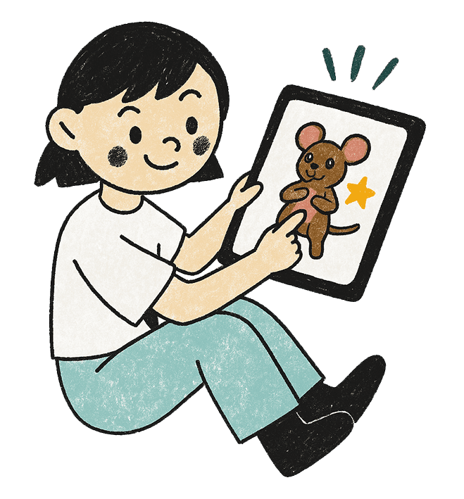
Jump into interactive stories, games, and cultural adventures!

1
An adult helps get started by setting up the Folktale Friends app.
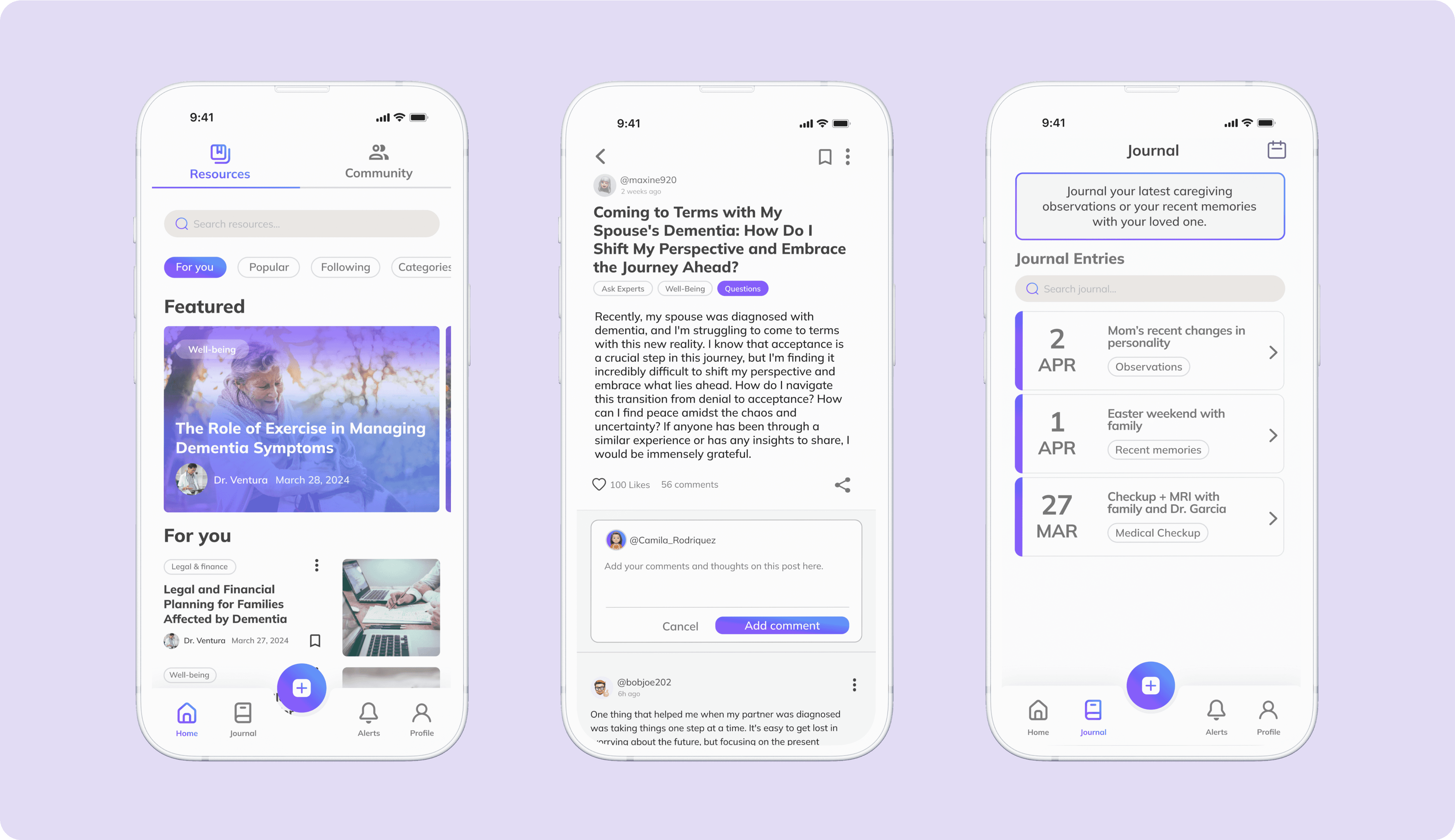
How it Works
Fun and Education
Children can dive into reimagined traditional folktales from around the world, each offering meaningful lessons and cultural insights contained with interactive mini-games to reinforce learning and keep them engaged through play.
Parental/Grown-Up Control
Parents, guardians, and educators create their own account to manage connected young explorer profiles. Features such as purchasing new Folktale Friends or adjusting app settings are password-protected, ensuring that children engage with the app safely and with appropriate oversight.
Collect Folktale Friends
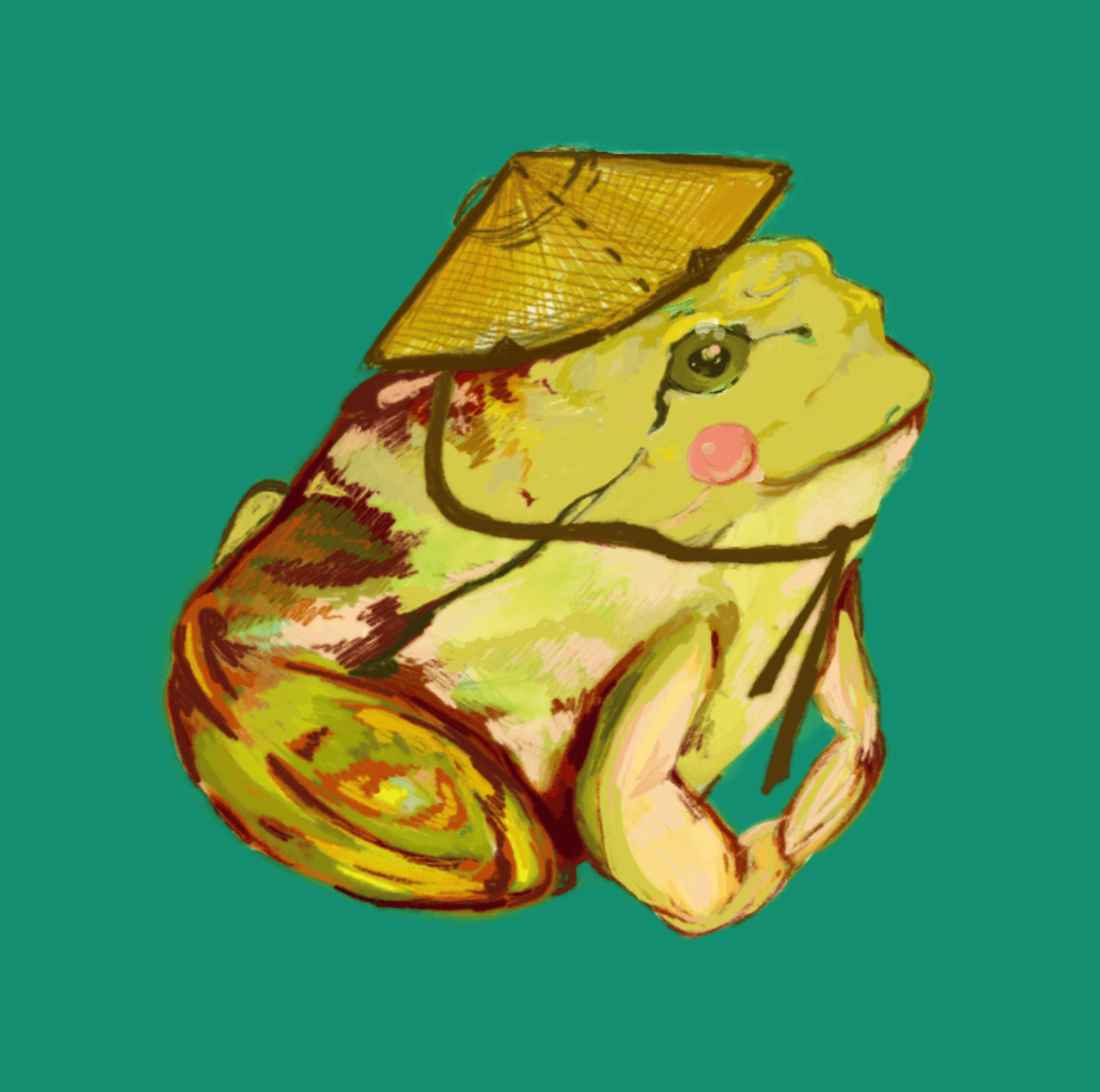
Young Explorers can expand their story library by scanning unique QR codes that come with each Folktale Friend figurine. Every scan unlocks a new character and their corresponding folktale, introducing kids to diverse cultural stories, valuable life lessons, and playful themes from global traditions.
Process
Competitor Analysis
I first conducted a competitor analysis to understand the pros and cons of current significant educational games, toys, and tools, focusing on how they facilitate both learning and gamification, and how the incorporate culture.
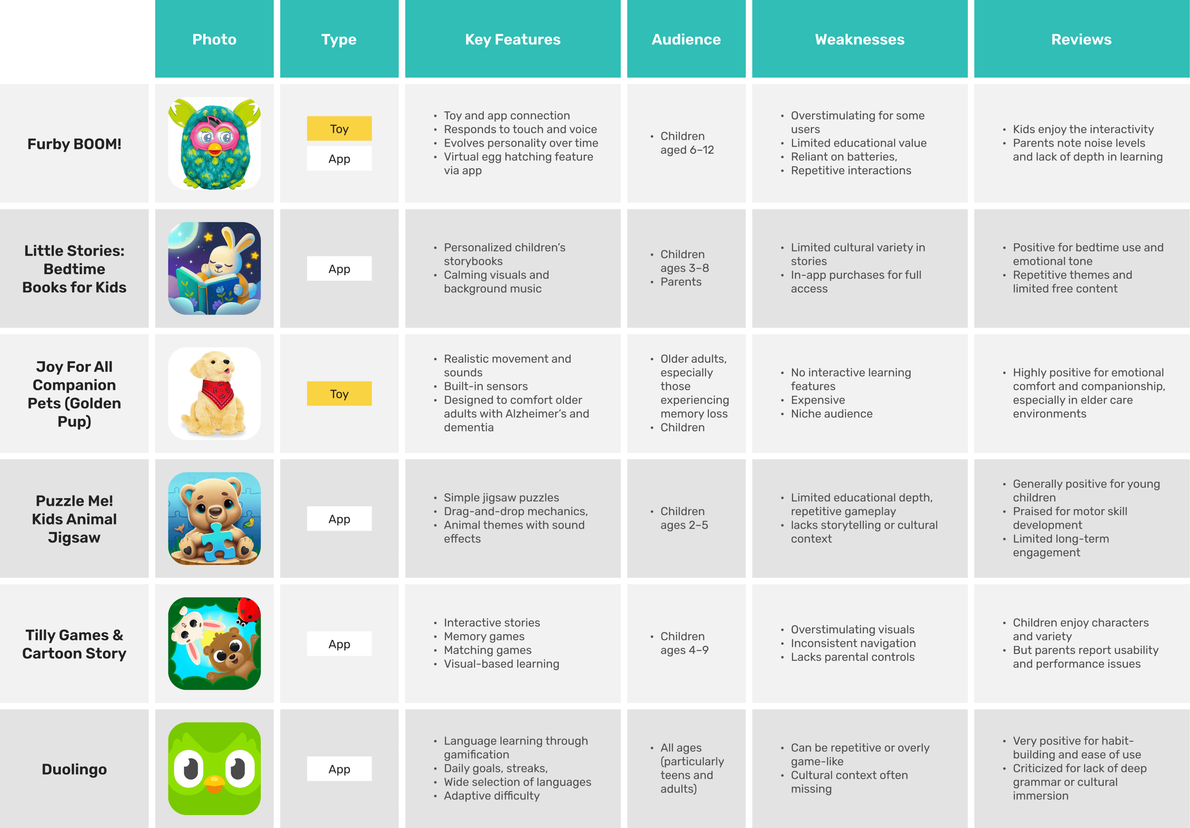
I noticed that many children’s products swing between overstimulation and shallow learning. Apps like Little Stories and Duolingo often lack meaningful cultural depth, and few tools are thoughtfully designed for both children and caregivers. With these insights, we set out to create a calm, story-driven experience rooted in underrepresented folktales.
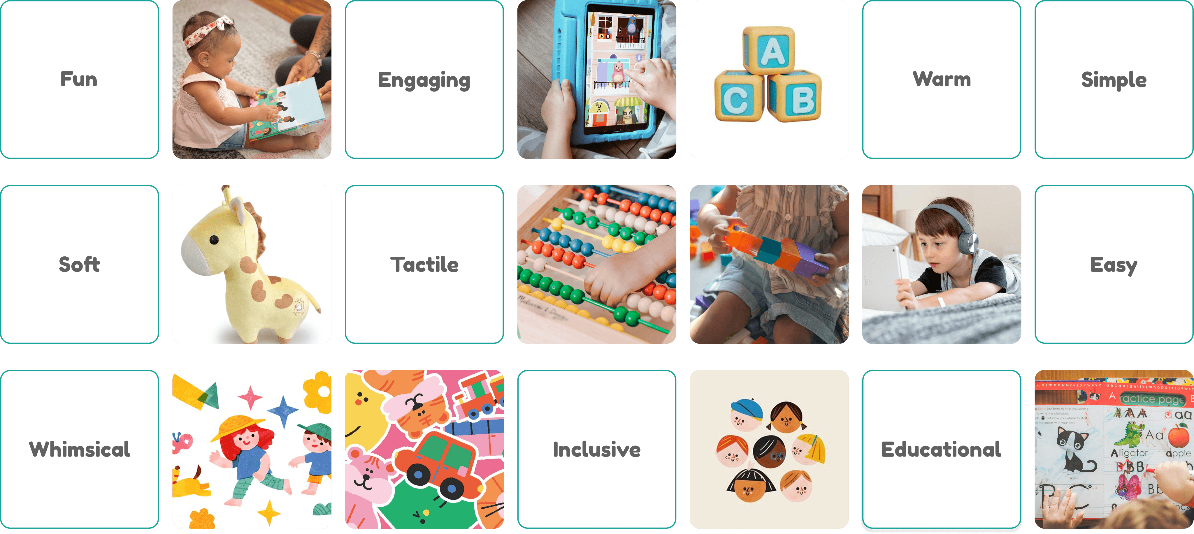
Visual Direction & Moodboard
Folktale Friends is designed to feel warm, playful, and intuitive for young users. Our visual direction blends modern UI with nostalgic, storybook-inspired illustrations, using:
Soft, vibrant colours to engage without overstimulating
Rounded shapes and friendly icons for approachability
Icon + text navigation to support early readers
High contrast and clear layouts for accessibility
Brainstorming
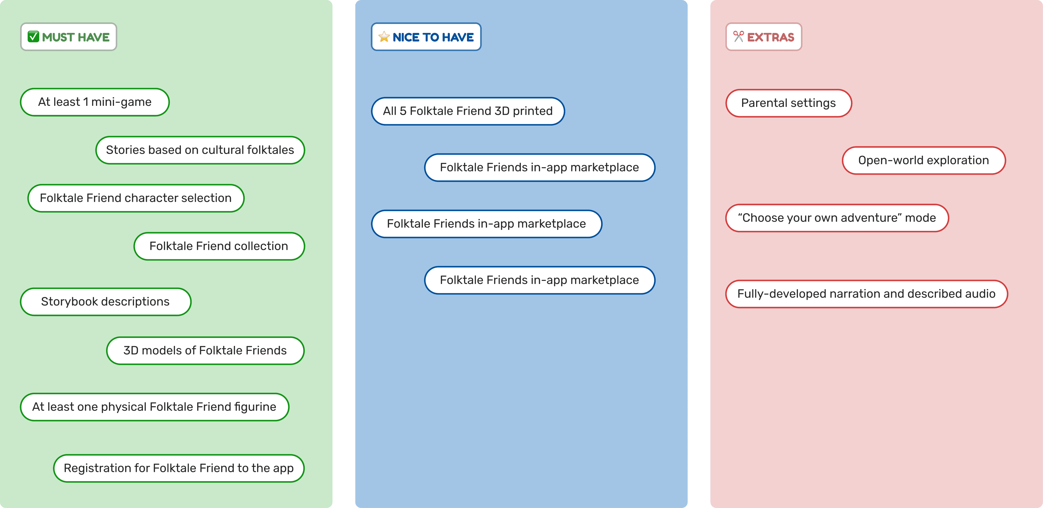
We identified key features for Folktale Friend which were then categorized into three groups like "Must have", "Nice to have", and "Extras" based on their priorities in order to deliver our product by 3 months.
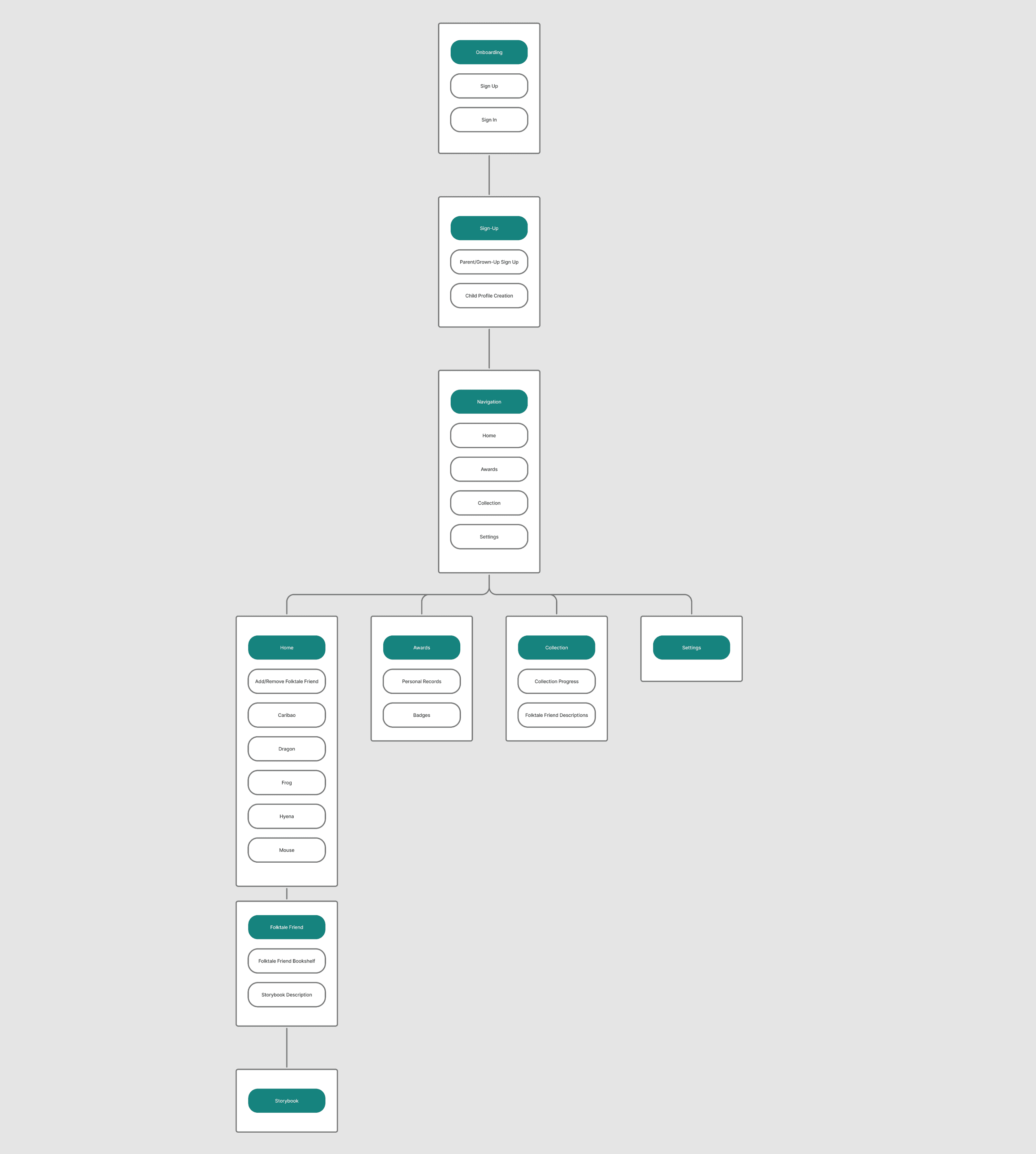
Screen Flow
After prioritizing core features with my team, I created a screen flow chart to visualize how users would navigate the app and complete key tasks. I focused on keeping the experience simple and intuitive. Once onboarding is complete, children can jump straight into stories and games without unnecessary steps or distractions that may cause confusion or sensory overload.
Wizard of Oz Prototyping
Wizard of Oz (WoZ) prototyping is a user testing method where core features of a product are simulated manually behind the scenes—often by a person acting as the "system." This approach allows teams to test and validate user experiences early in the design process, without requiring fully developed functionality or production-ready assets.
At this stage of the project, our team had not yet finalized visual illustrations or interactive features in Figma. To simulate the experience for our test users in the classroom:
We roleplayed the app experience with our users, guiding them through interactions as if the product were fully functional.
We used AI-generated images to act as placeholders for our final storybook illustrations.
The folktale narratives were fully written but not yet illustrated, so we paired them with the generated visuals.
We used a rough interactive prototype to mimic key moments such as scanning a toy, unlocking a story, and engaging with the app. This allowed us to gather feedback on usability, story clarity, and engagement before development.
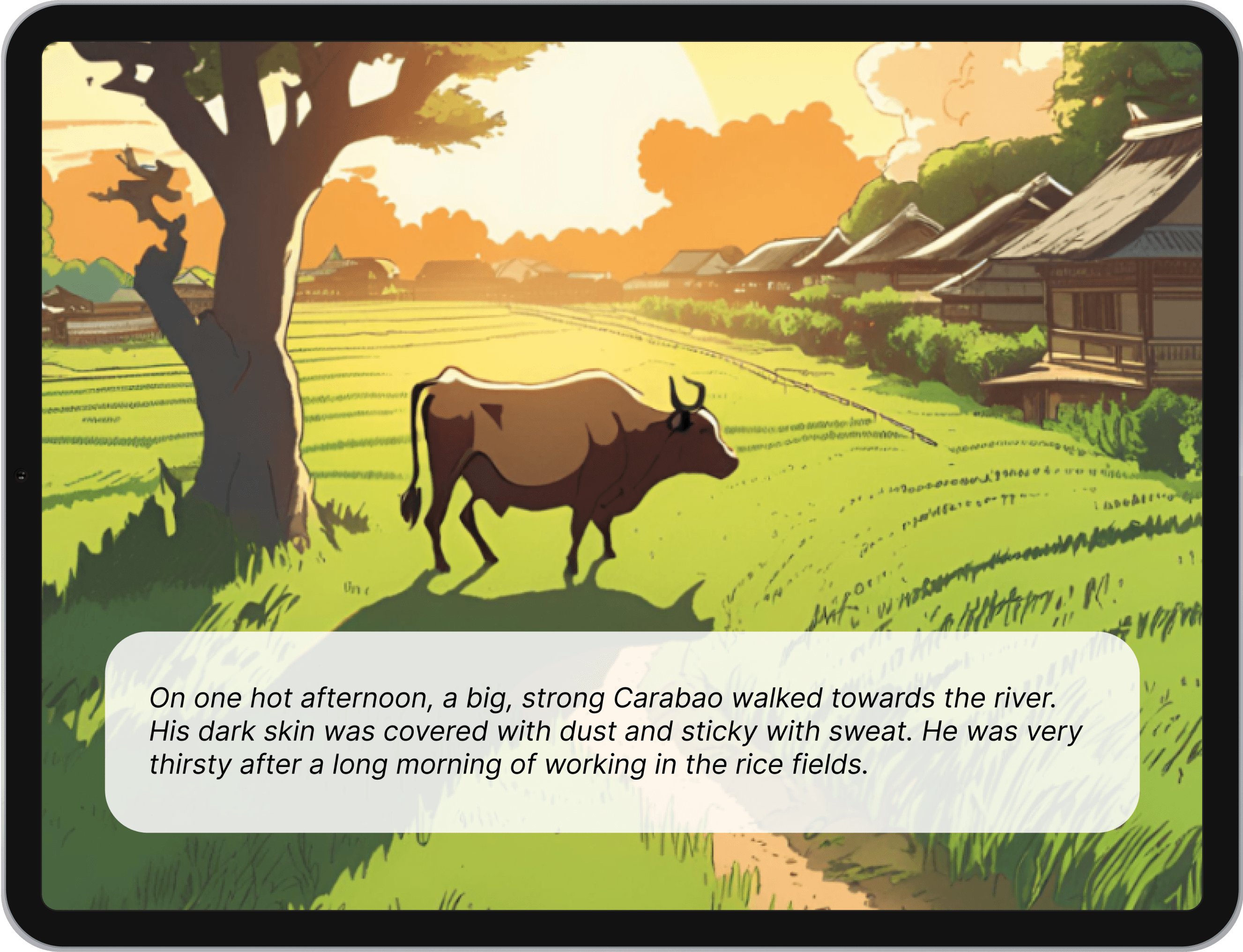
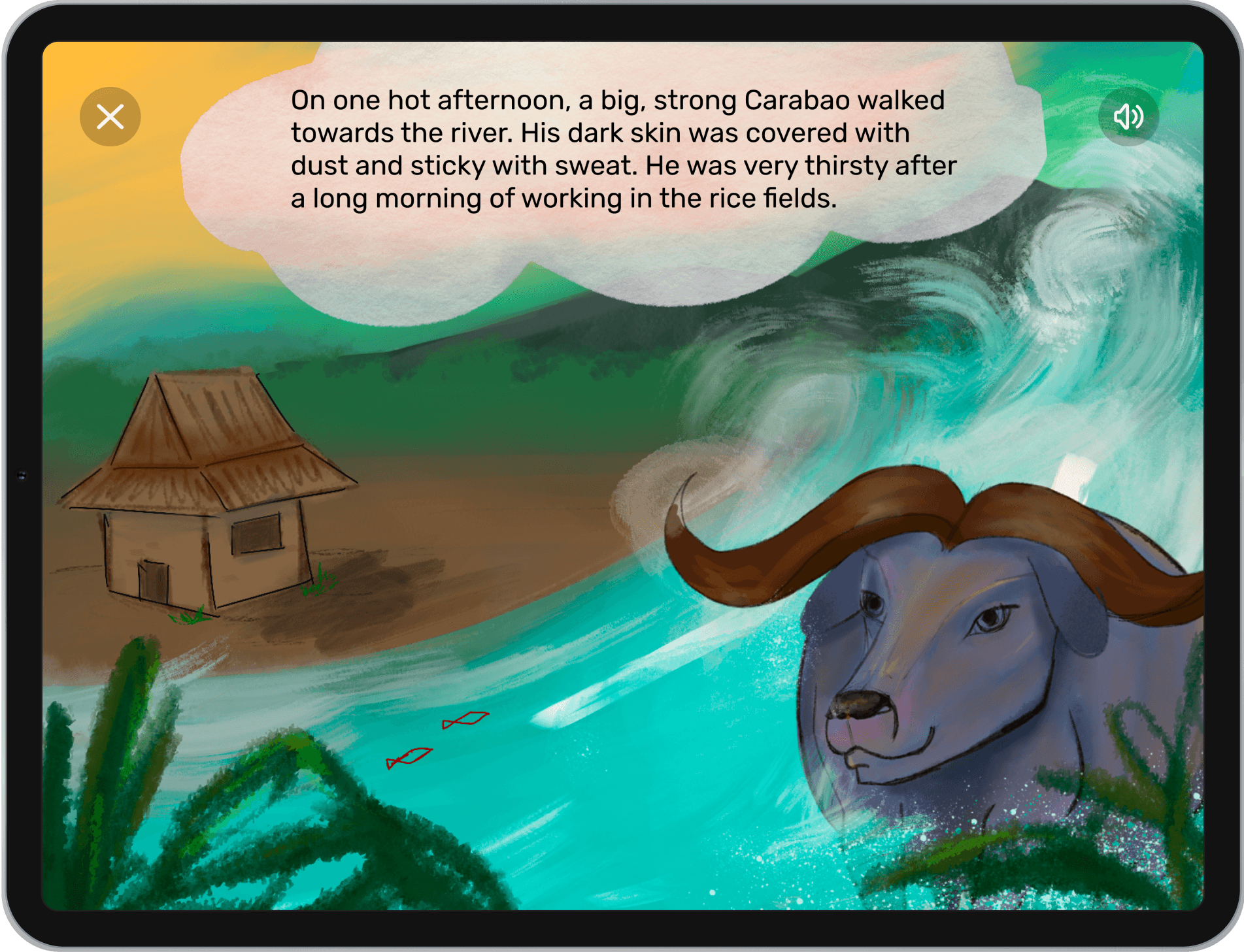
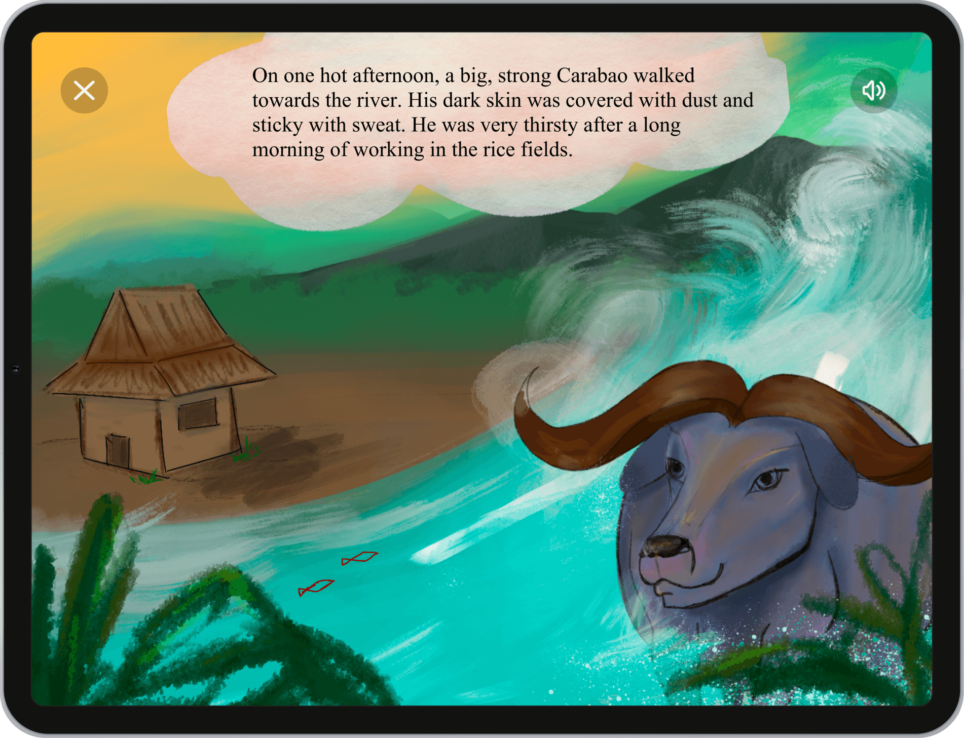
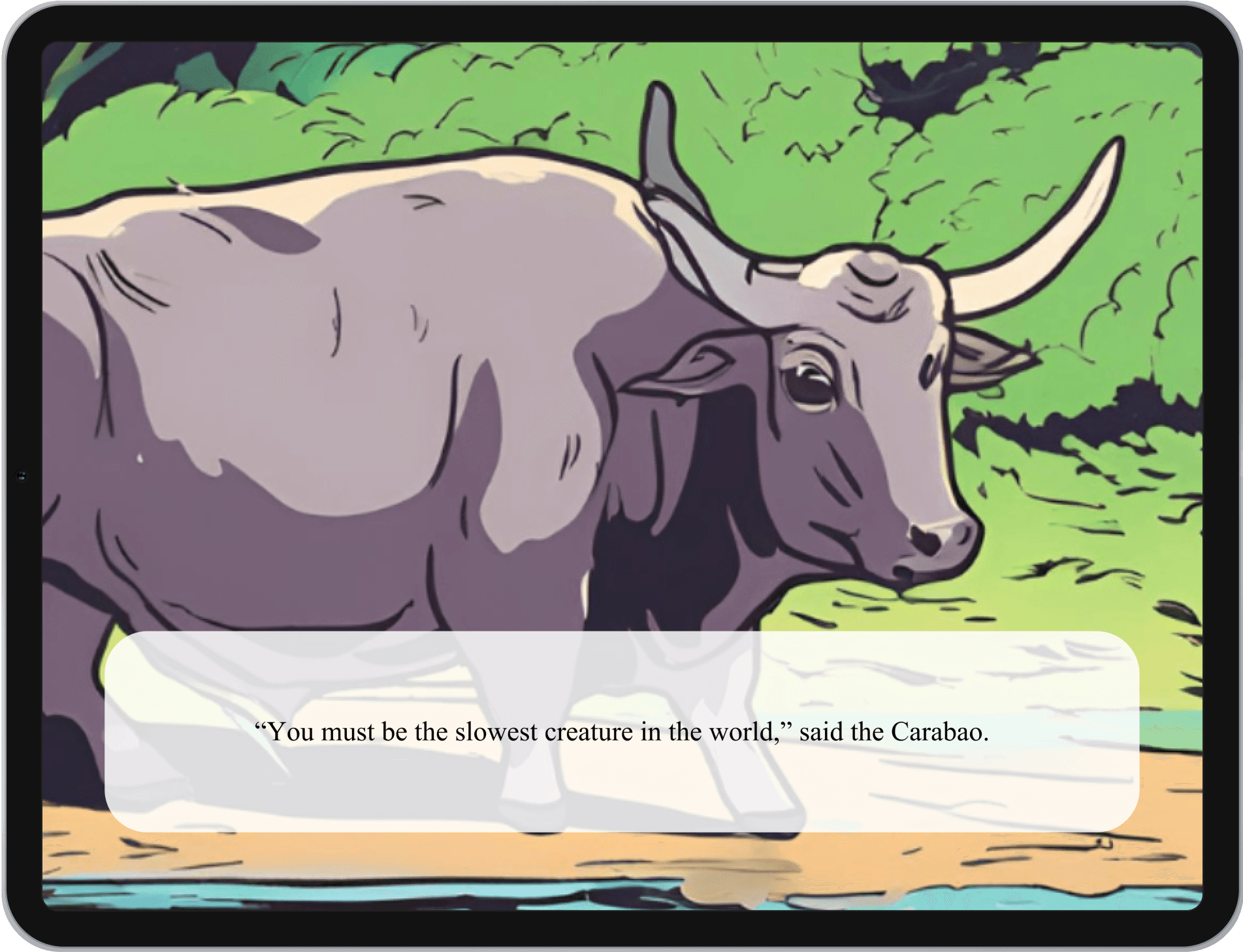
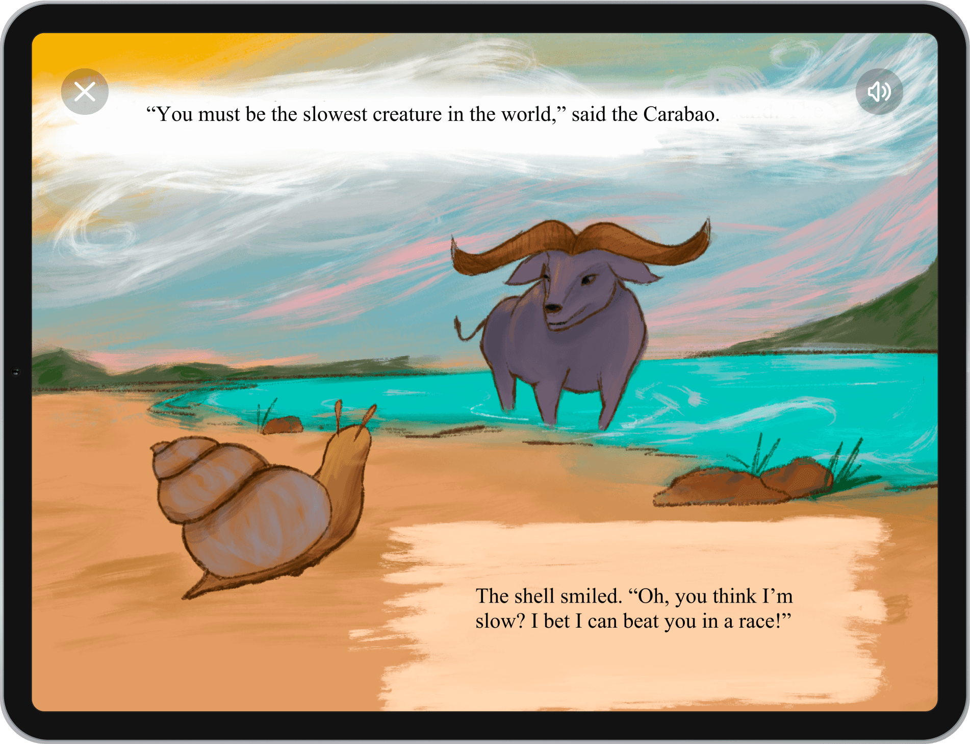
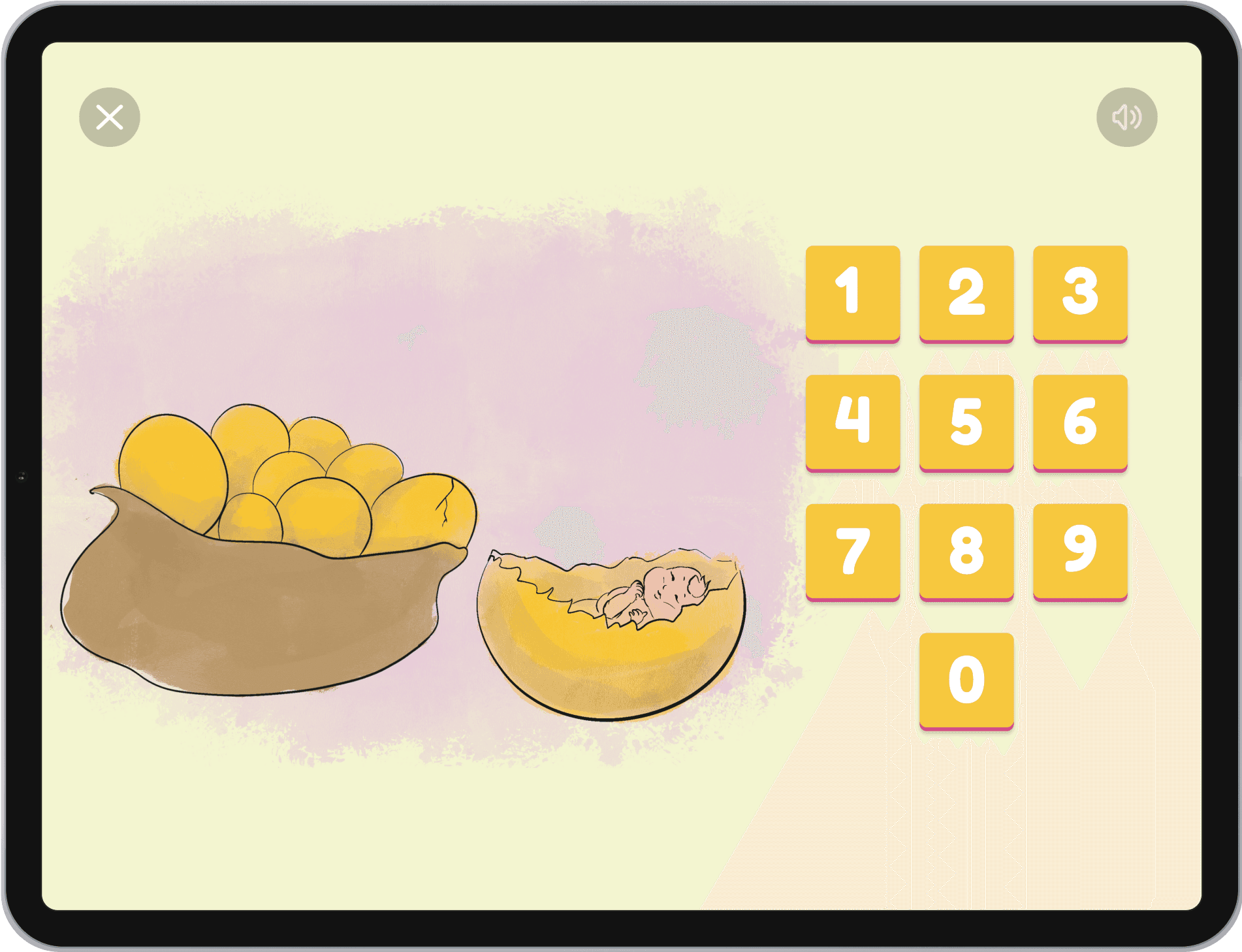
Carabao and the Shell story early Wizard of Oz prototype containing AI-generated illustrations.
Low-Fidelity Wireframes
After defining the key features of the app, I moved on to the design phase, where I created low-fi wireframes with a focus on simple, straight-forward design. These wireframes allowed me to visualize how each page would incorporate essential information such as Folktale Friend and game selections and descriptions.

High-Fidelity Wireframes
Once I received the finalized illustrations from our illustrators and 3D artist, I began transitioning our low-fidelity wireframes into high-fidelity screens. I also copied and pasted the fully written stories provided by our story writer, inserting them into the appropriate layouts alongside the visual assets.
User Tests and Surveys
Although we were only able to test with classmates weekly during class, we conducted a range of methods to gather meaningful feedback: think-aloud tests, where users verbalized their thoughts as they interacted with the app and observational testing where we watched how users navigated the interface without instruction. Our most pivotal test was our A/B test and survey, where we asked users to interact then compare and choose between different storybook formats and font styles.
A: Rubik
“Clear and look modern”
“More professional”
“Overall more visually pleasing”
B: Times New Roman
“More calming and apealling”
“Whimsical”
“Looks more like a storybook”
Next, we asked asked classmates if they preferred the story to be told using a subtitle rectangle or for the text to be integrated into the illustration, or no preference.
A: Subtitle style
“Easier to read”
“Easier to see background”
“Appreciate the illustrations more”
B: Storybook style
“More engaging”
“Seems more immersive”
“More fun to read”
User Survey Results
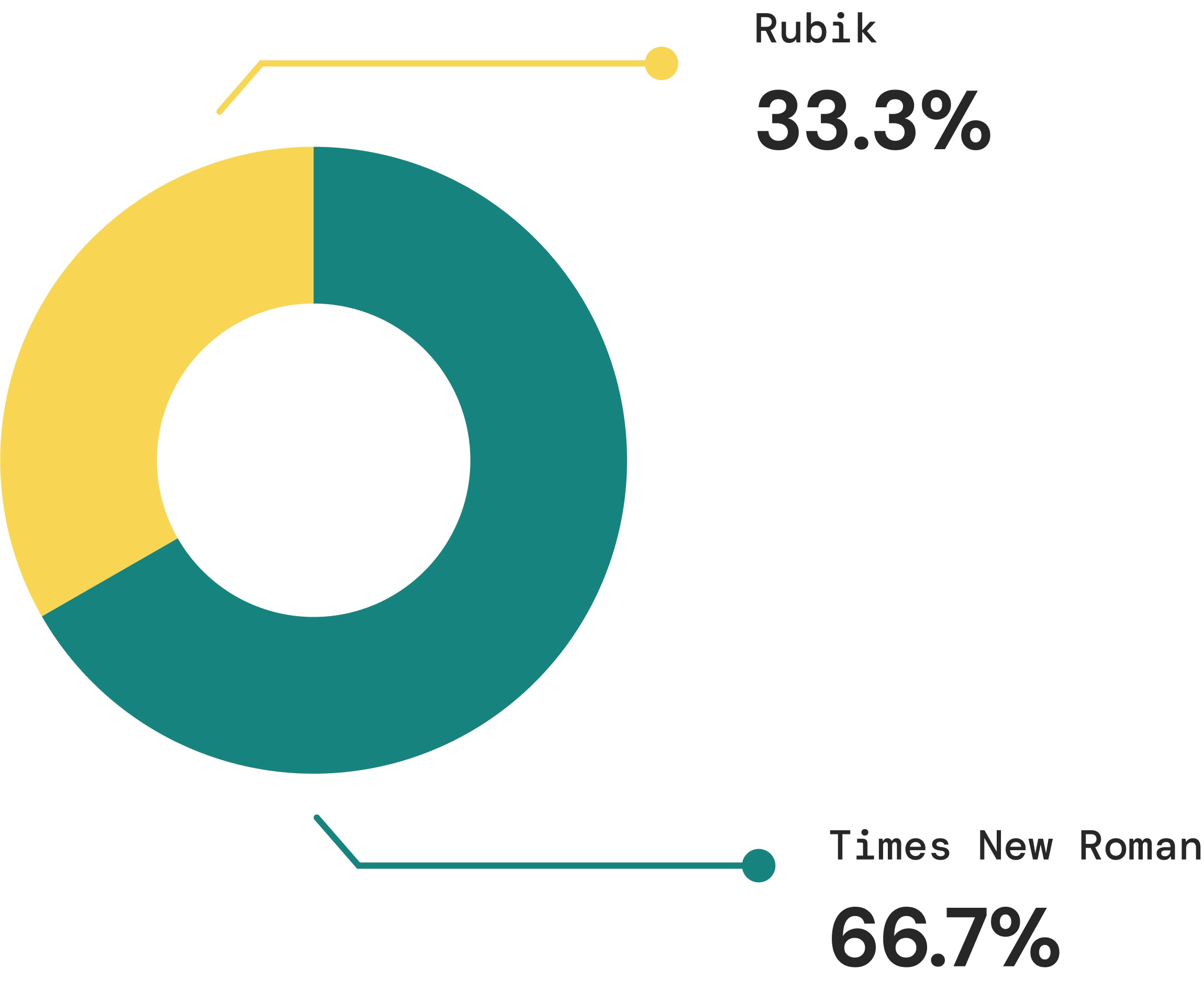
Users most preferred Times New Roman, attributing the font to themes such as nostalgia, familiarity, and a traditional storybook feel.
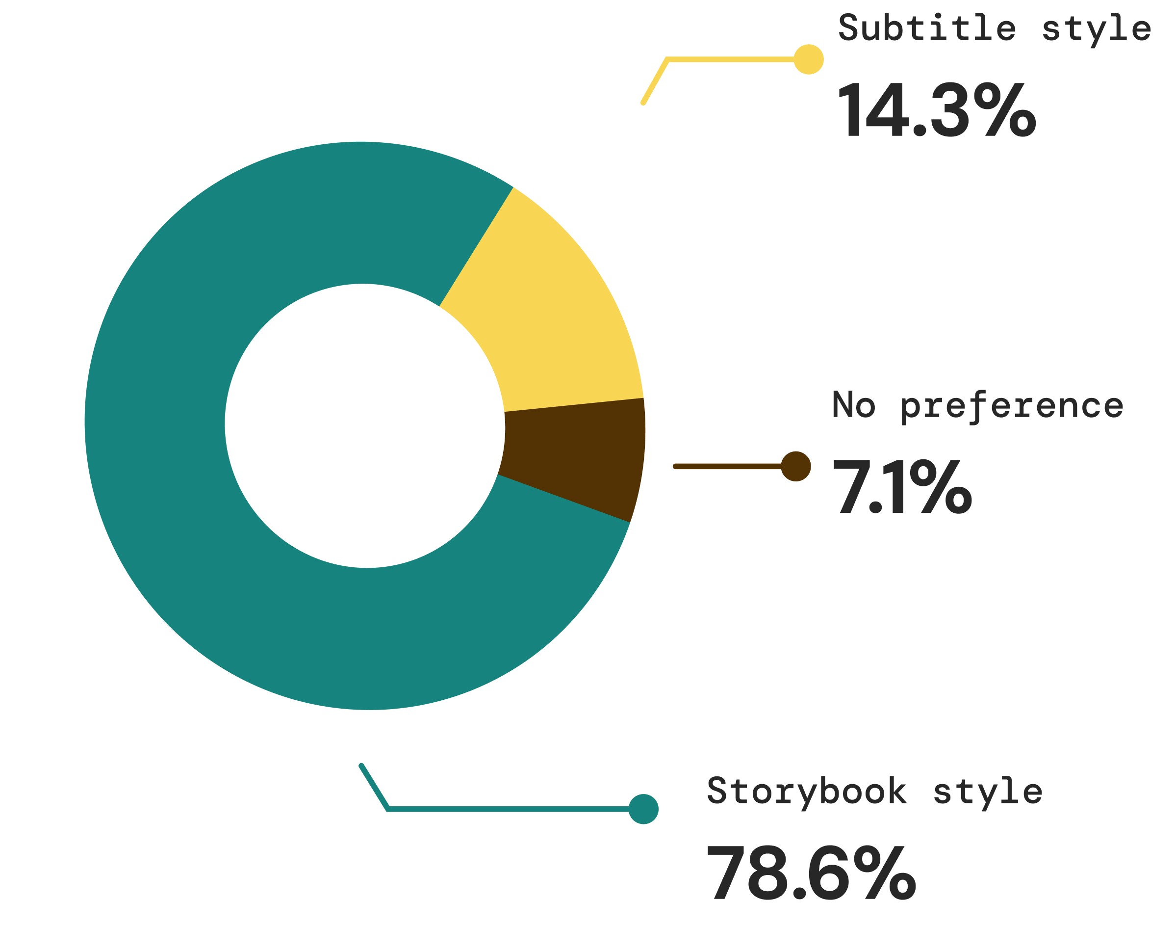
Users most preferred the storybook style, where the text is integrated into the story.
After this user test, we ultimately approached our storytelling with a conventional method seen in physical storybooks, as this method garnered the most appeal in engagement and cohesion. Moreover, this design decision also met the project goal of adapting traditional play such as storybooks in a more modern way. We did note that 33.3% voted for Folktale Friends’ default font, Rubik, so we kept the Rubik font for screen-pop-ups within the stories that explain mini-games and further context for the story:
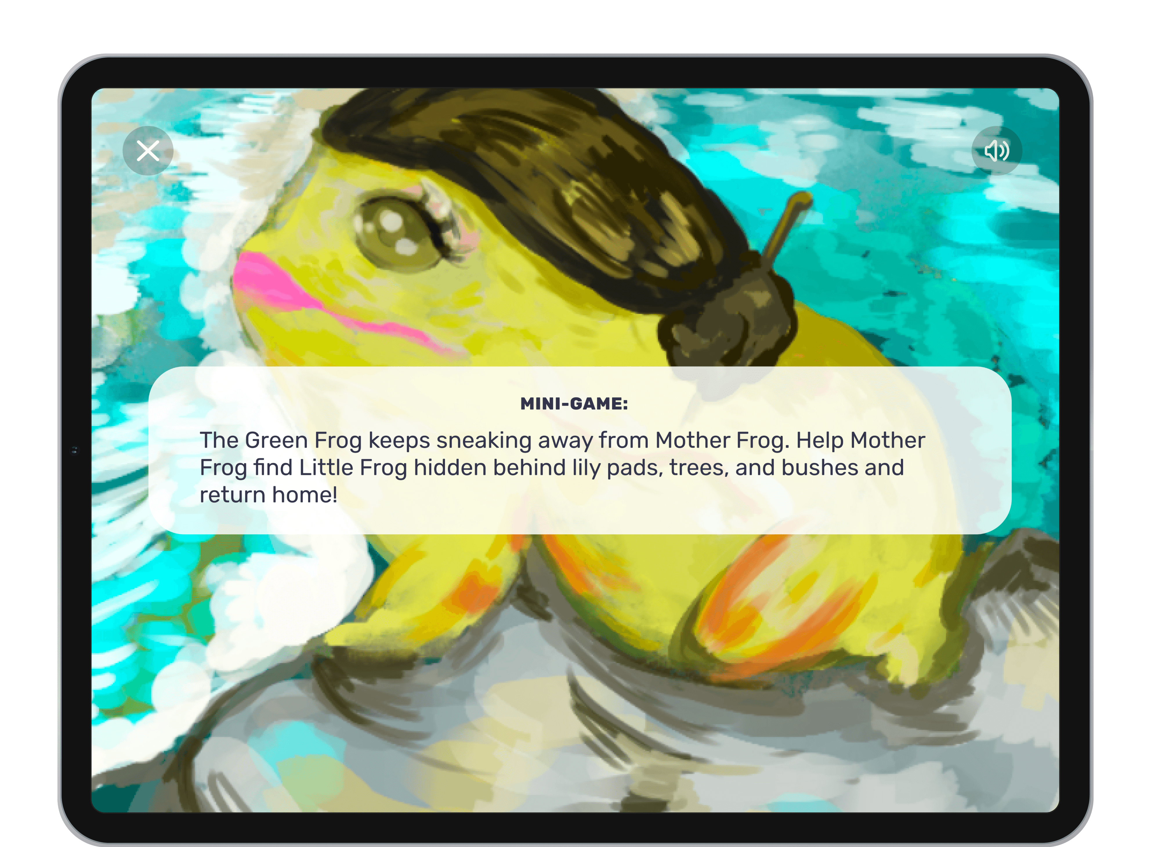
Minigames
We integrated low-stimulation games like memory match, counting challenges, and racing games that could align with each story’s theme and reinforce the narrative in a fun way. Each game was tested by students in-class for simplicity, clarity, and accessibility.
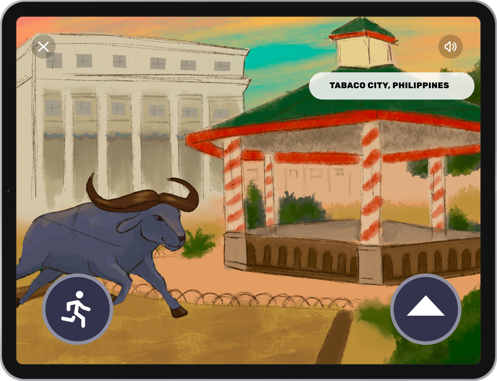
Tapping / Racing Game 🏁
Encourages reflexes and aligns with fast-paced story moments (e.g., animal chases)
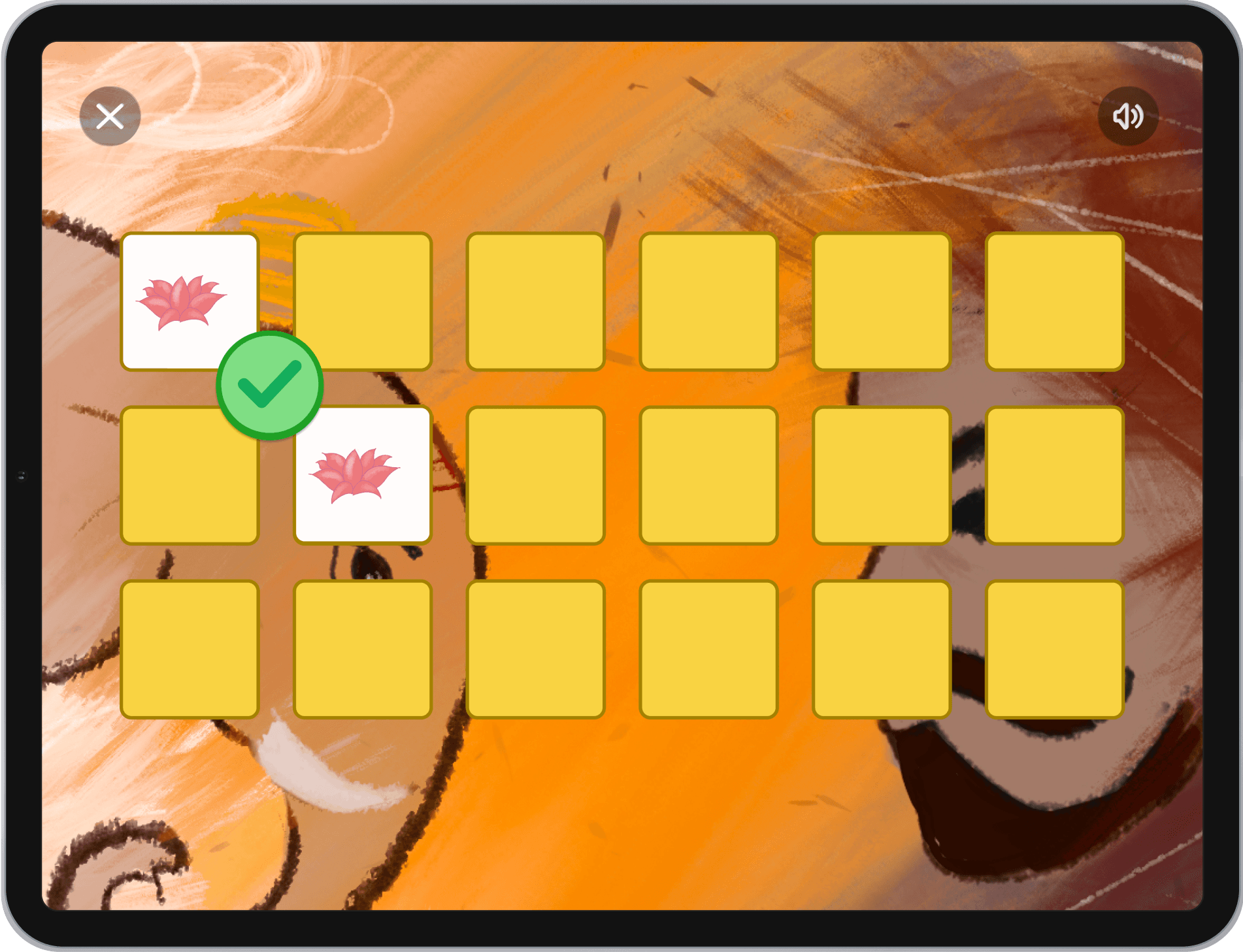
Memory Matching Cards 🧠
Supports visual recognition and short-term memory, featuring cultural elements from the story
Hide and Seek 👀
Promotes attention to detail as users find hidden characters or objects within an illustrated scene
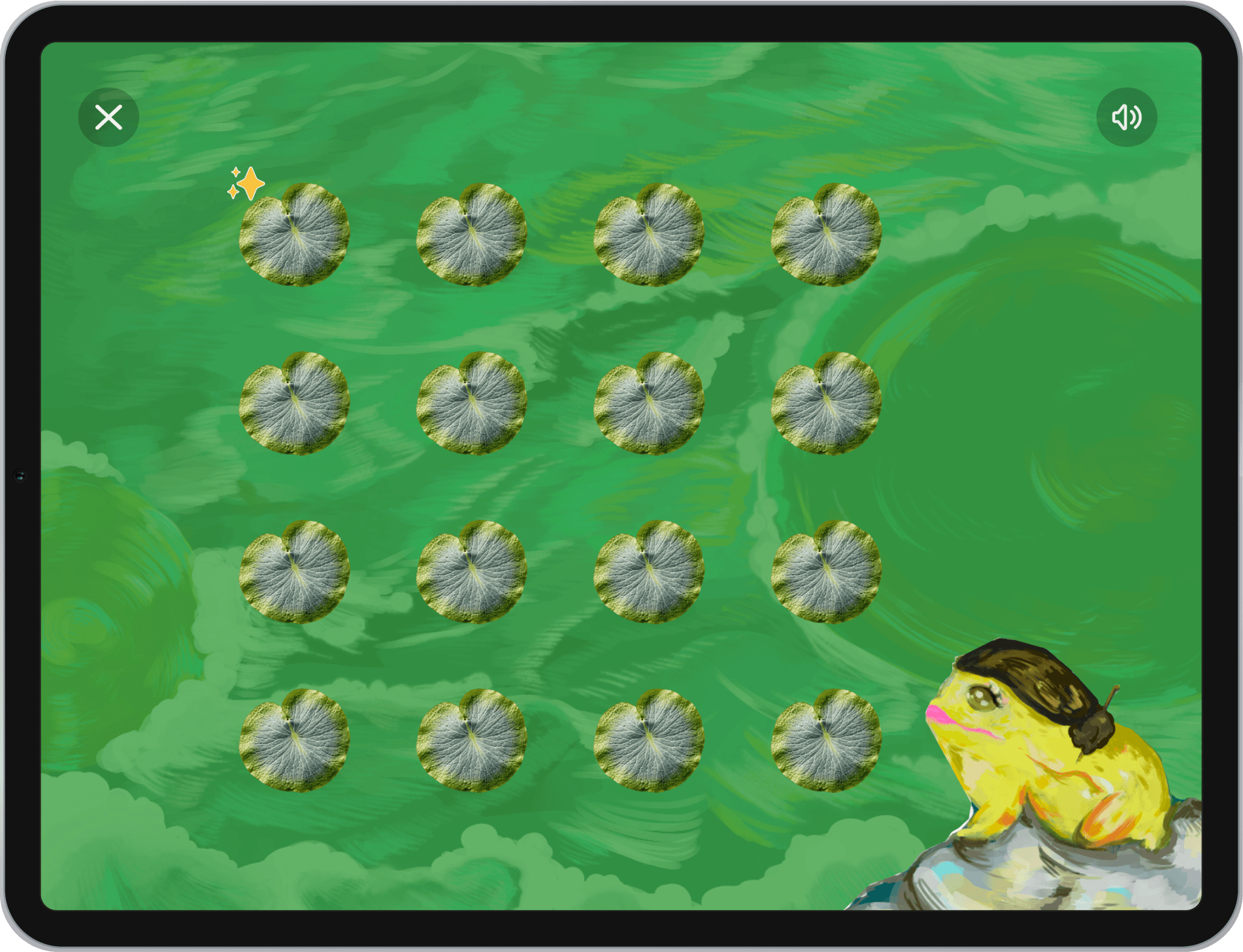
Counting Games 🔢
Builds early numeracy by prompting users to count story-related objects
Initially, we considered incorporating more text-based activities like word searches, but we decided to exclude them after realizing they would be too advanced for our younger users—particularly children as young as three. We prioritized simplicity, accessibility, and alignment with the story’s pace, ensuring each mini-game added to the learning experience without overstimulating or confusing the user.
Visuals and Branding
Design System
App Icon
Title
Primary Colours
Charcoal
#4A4A68
OFF WHITE
#FFFCFB
ASH
#858585
Main app colours comply with WCAG Level AA contrast standards.
Secondary Colours
strawberry
#DE7F7F
mango
#F9D342
jade
#7FDE83
tide
#30BEB6
ocean
#3A61E2
Taro
#A18CE1
Secondary colours carry the theme of nature with its hues found in nature, perfect for depicting our theme of culture and exploration through play.
Interactive Features
Navigation Bar
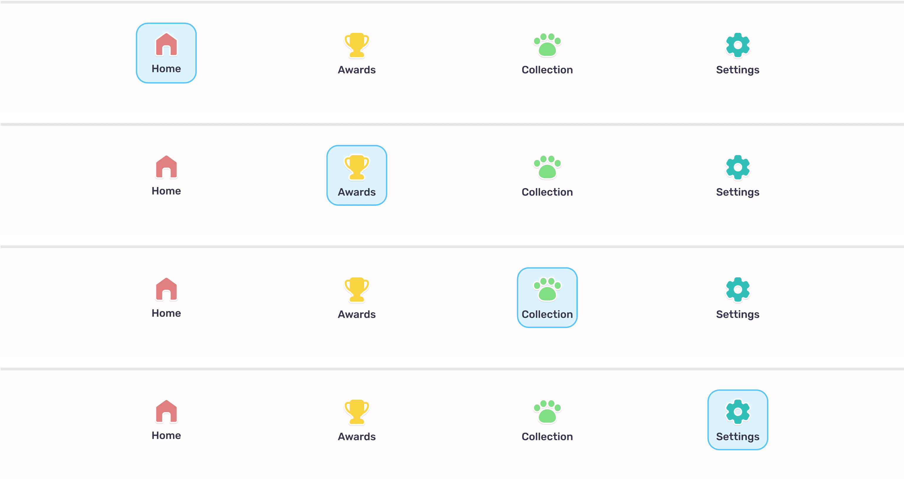
Icons include descriptive labels; high-contrast outlines for visibility.
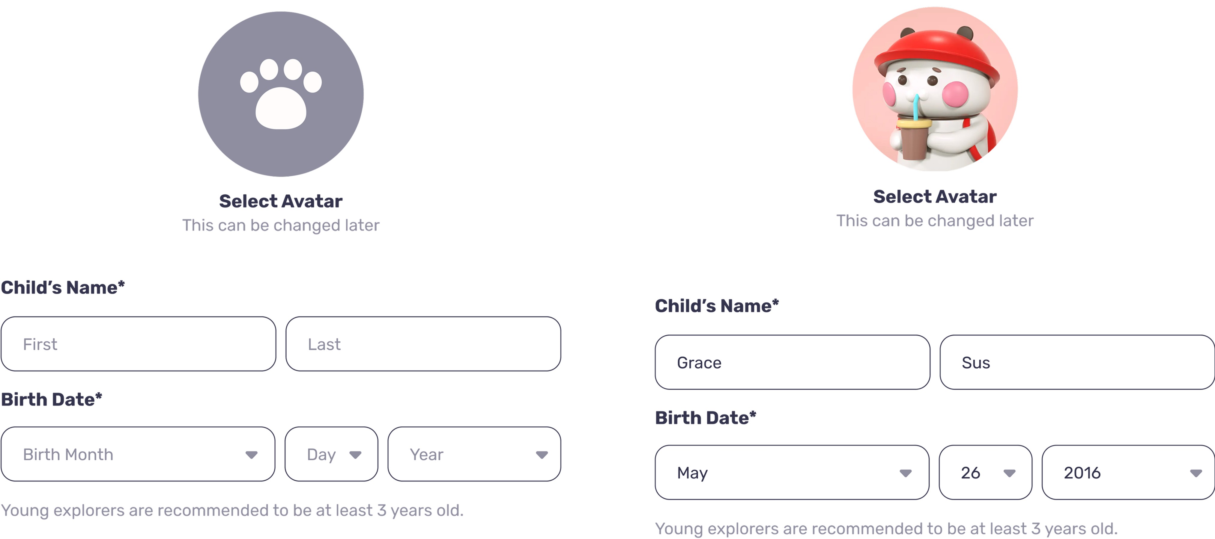
Sign-Up Form
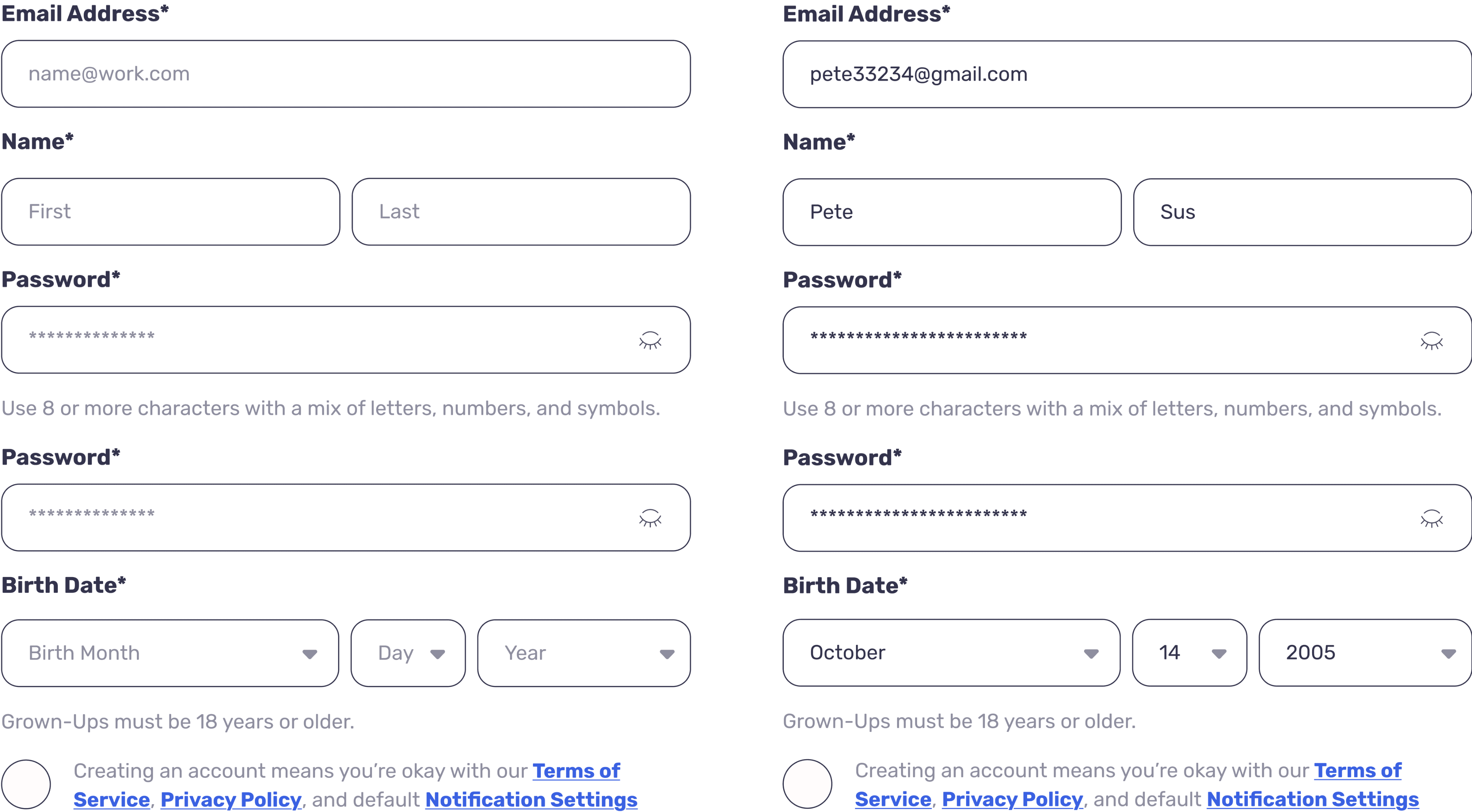
Young Explorer Profile Creation
Progress Badges
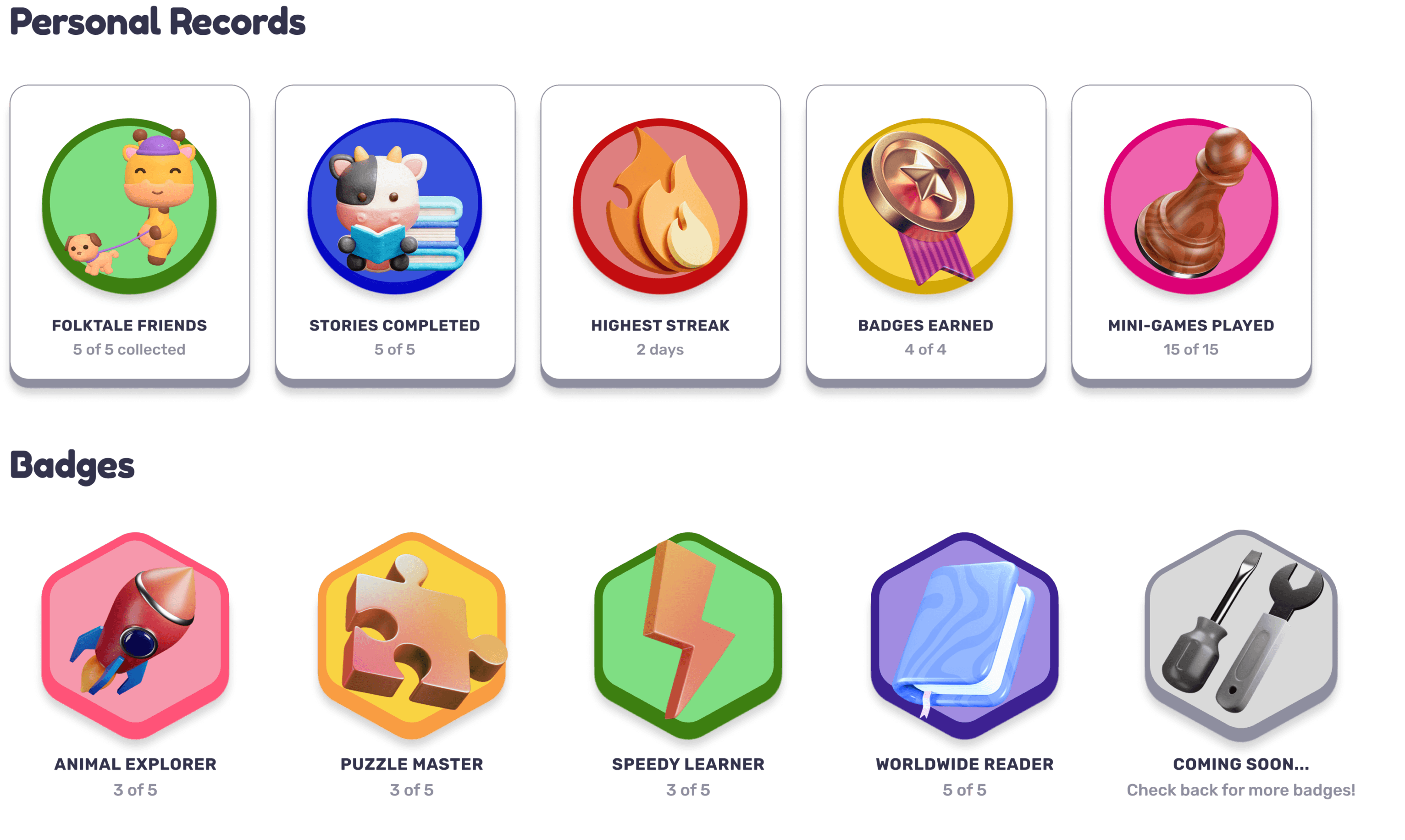
Rounded, bold, and minimalistic for easy recognition on iPad screens.
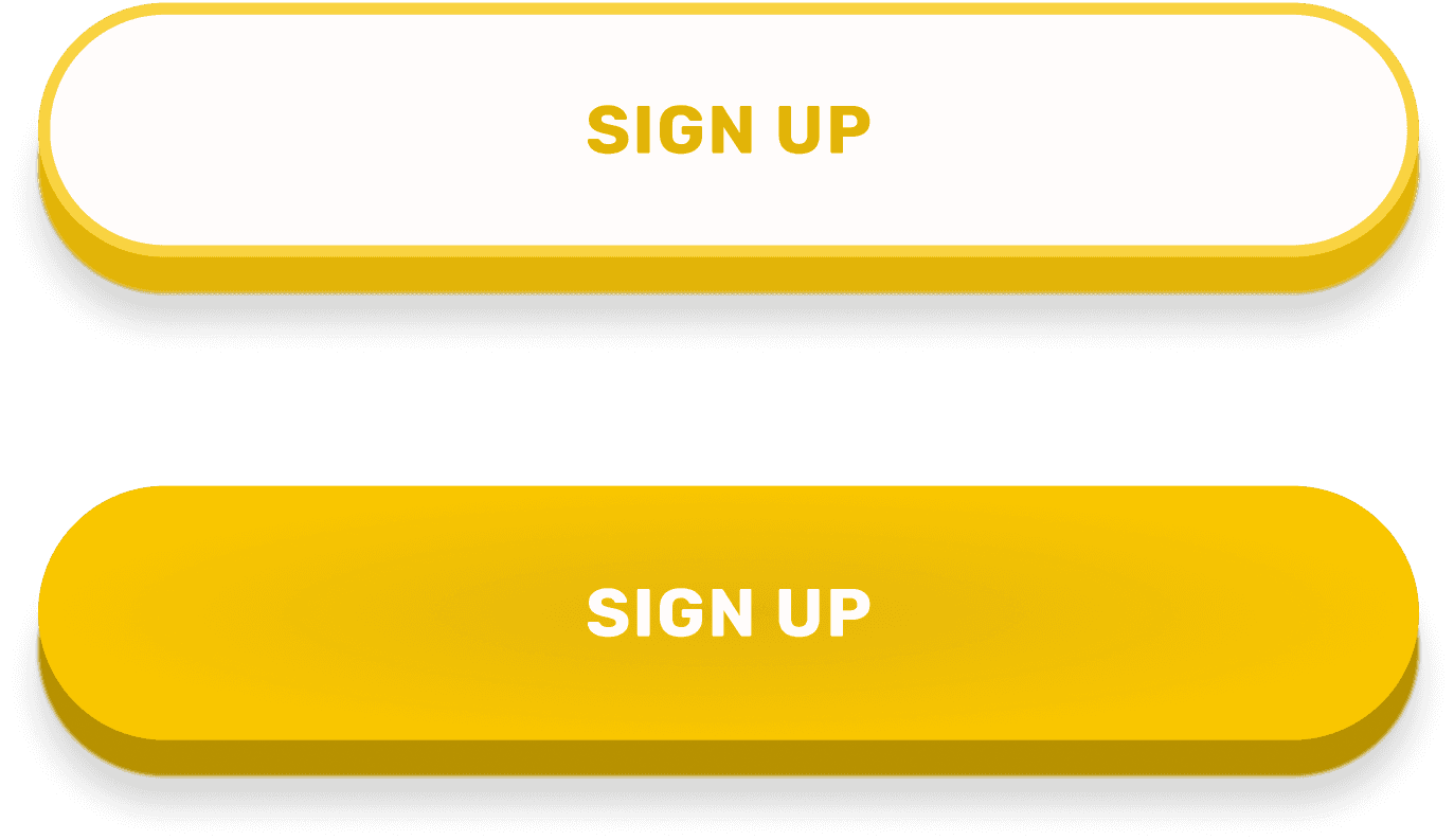
Selection Buttons
Typography
Stylized Font: Fredoka One
Aa Bb Cc Dd Ee Ff Gg Hh Ii Jj Kk Ll Mm Nn
Oo Pp Qq Rr Ss Tt Uu Vv Ww Xx Yy Zz
Aa Bb Cc Dd Ee Ff Gg Hh Ii Jj Kk Ll Mm Nn
Oo Pp Qq Rr Ss Tt Uu Vv Ww Xx Yy Zz
Default Font: Rubik
Aa Bb Cc Dd Ee Ff Gg Hh Ii Jj Kk Ll Mm Nn
Oo Pp Qq Rr Ss Tt Uu Vv Ww Xx Yy Zz
Aa Bb Cc Dd Ee Ff Gg Hh Ii Jj Kk Ll Mm Nn
Oo Pp Qq Rr Ss Tt Uu Vv Ww Xx Yy Zz
Storybook Font: Times New Roman
Storybook Font: Times New Roman
Aa Bb Cc Dd Ee Ff Gg Hh Ii Jj Kk Ll Mm Nn
Oo Pp Qq Rr Ss Tt Uu Vv Ww Xx Yy Zz
Aa Bb Cc Dd Ee Ff Gg Hh Ii Jj Kk Ll Mm Nn
Oo Pp Qq Rr Ss Tt Uu Vv Ww Xx Yy Zz
3D Models
Physical Figurine and Scan Card
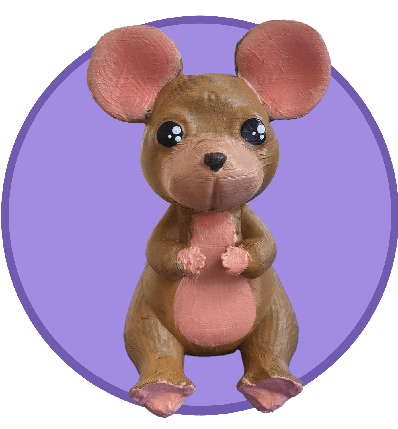
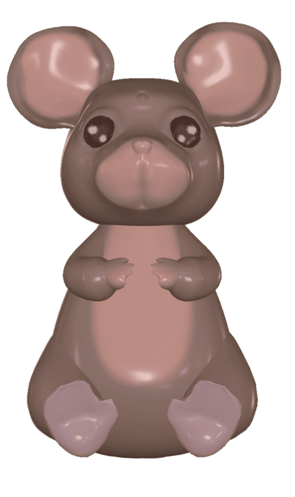
3D printed and painted Mouse Folktale Friend

Folktale Friends Mouse QR Code Scan Card
Future Implementations
What’s next?

Create and add more stories to introduce global cultures, traditions, values, and cultural elements to inspire curiosity, empathy, and a deeper appreciation for cultural diversity among children

Offer stories and app language in multiple languages (e.g., Chichewa, Spanish, Korean, Tagalog, Hindi, Vietnamese, French, Arabic, etc.)

Introduce more customizable controls (e.g., time limits, difficulty levels, or bedtime reading reminders)

Allow users to adjust reading settings like font size, text spacing, color contrast for better readability, multilingual audio narration and subtitles, and navigation for hands-free use
What I Learned
Key Takeaways
Designing for Dual Audiences 🎯
I learned the importance of balancing two user groups: children and their parents or educators. The interface needed to be playful and intuitive for kids, while also being safe, trustworthy, and easy to navigate for adults.
Letting User Testing Guide Details 🔍
User feedback shaped several design choices, especially around typography. One surprising insight was the strong preference for Times New Roman over Rubik, as users associated it with nostalgic, storybook-like reading.
Prioritizing Under Pressure ⏱️
With only three months to design and prototype, we focused on delivering core features: storytelling, accessibility, and onboarding. Stretch features were documented for future development.
Validating Through Peer Testing ✅
Although we couldn’t test with our target audience, we built and tested a high-fidelity prototype using feedback from classmates. This feedback emphasized the product’s cultural depth, tactile-digital interaction, and engaging experience.
Limitations
Limited Access to Target Users 👶
We weren’t able to test with our core audience: young children and their caregivers. Due to time and ethical constraints, we tested with classmates, which limited insights into how children would engage with the app’s stories, characters, and toy interactions
Testing Environment Constraints 🧪
Without the real-world context of at-home play or co-use with a parent, we couldn’t fully evaluate how the app fits into everyday routines or learning environments.
Tight Timeline = Feature Trade-Offs ⏳
With only 12 weeks to design and build, we had to prioritize essential features and defer advanced ideas like personalization, multi-language support, or audio narration enhancements for future iterations.
Improvements
Test with Real Families 👨👩👧
I would conduct usability testing directly with children aged 3–8 and their caregivers. Parent-child paired sessions would help reveal how families engage with the app together and whether it supports shared interaction as intended.
Include Children in the Design Process 🎨
I’d run participatory design activities such as allowing kids to choose characters, react to story moments, or draw their own folktale ideas—to better understand what excites them emotionally and visually.
Gather Caregiver Perspectives 📝
I’d interview caregivers and use diary studies to learn how they perceive the app’s educational value, ease of use, and appropriateness. Their feedback could offer insights into long-term use and integration into daily routines.
Deepen Insights with Contextual Research 🔍
With more time, I would move beyond preference-based surveys to explore emotional response, learning impact, and story comprehension, ensuring the product is both beautifully designed and effective for its audience.
10. Acknowledgements
Thank you <3
A big thank you to my incredible teammates. I’m so grateful for the creativity, collaboration, and positive brought to this project. Thank you for making this process not only seamless but genuinely fun. :)
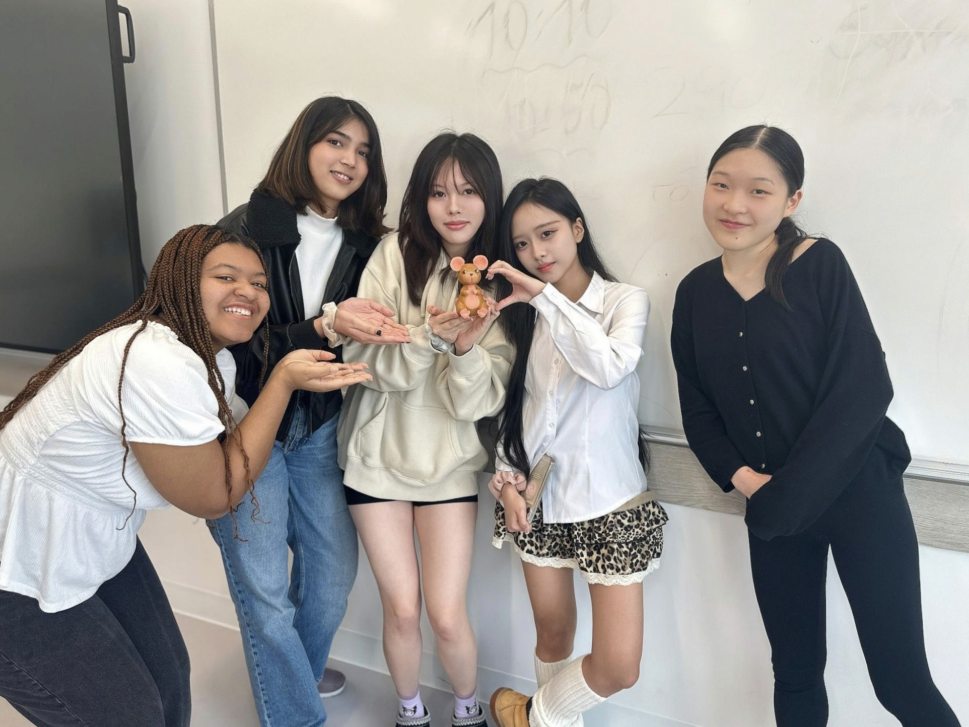
From left to right: Ami (Storywriter), Kenisha (Illustrator), Eira (Illustrator, 3D Artist), Me, and Emily (Illustrator, Project Manager)
You reached the end!
Check out my other work!
MemoryLane
Empowering dementia carers with resources, community, and personalized care tools.
🔍 Case Study
📱 Mobile App
🏥 Health Care