Table of Contents
Brief
Memory Lane is a mobile app designed to support caregivers of individuals with dementia by offering centralized resources, emotional support, and tools to track their caregiving journey. Created over the span of two months, this project focused on addressing the growing emotional and informational challenges faced by dementia caregivers.
jump to final prototype
Introduction
For our final project in UBC INFO 300: Design Methods, we were given one month to collaboratively design a tool that addresses a real-world problem. The assignment was based on the Royal Society of Arts (RSA) Student Design Awards 2023–24, developed in partnership with The Rayne Foundation. From four provided design briefs, we chose to explore and respond to a challenge focused on improving care for older adults and their caregivers.
We selected Brief 4: Caring Culture, which focused on reimagining systems of care. The guiding "how might we" question was:
How might we improve the lives of older adults and their carers by encouraging and enabling cultures, and higher standards, of care?
This brief challenged us to design with empathy and fostering dignity, support, and connection within caregiving relationships.
Research Summary
Following the COVID-19 pandemic, the care industry has gained new attention, particularly around the need for quality care for older adults.
The demand for care is increasing at a rate the system can’t keep up with. Care workers, nurses, and family caregivers are under immense pressure with limited support.
Caregivers struggle to balance their responsibilities with their own mental and physical well-being. Many feel isolated, overwhelmed, and lack access to centralized resources.
By 2030, nearly 1 million people in Canada are expected to be living with dementia, pressing the need for scalable, accessible tools to support caregivers.
Problem & Key Question
We discovered that care workers, nurses, and family members are struggling to provide quality care while maintaining their own well-being. Many face emotional exhaustion, resource scarcity, and isolation, especially when caring for individuals with dementia. To guide our design process, we reframed our focus with an updated How might we question:
How might we make it easier for dementia caregivers to access resources while building emotional and social support?
User Insights
User Journey
To better understand our user’s experience, we created a user journey map to identify key pain points. One of the most prominent challenges we uncovered was the mental exhaustion caused by navigating an overwhelming amount of scattered dementia-related information and resources.
The main user pain point is that there is a depletion in users trying to navigate through an abundance of information and resourcs about dementia.
User Needs
Find Resources
Caregivers need access to reliable, centralized information about dementia and care practices.
Find Support
Users are looking for a sense of community—people who understand their challenges and can offer empathy, advice, and encouragement.
Simplify Complexities
Users want tools that help break down complex information and tasks into manageable pieces.
Solution
An app designed for caregivers of individuals with dementia, offering access to credible resources, a supportive community forum for guidance and encouragement, and a features to track care experiences, emotions, and milestones through a personal journal.
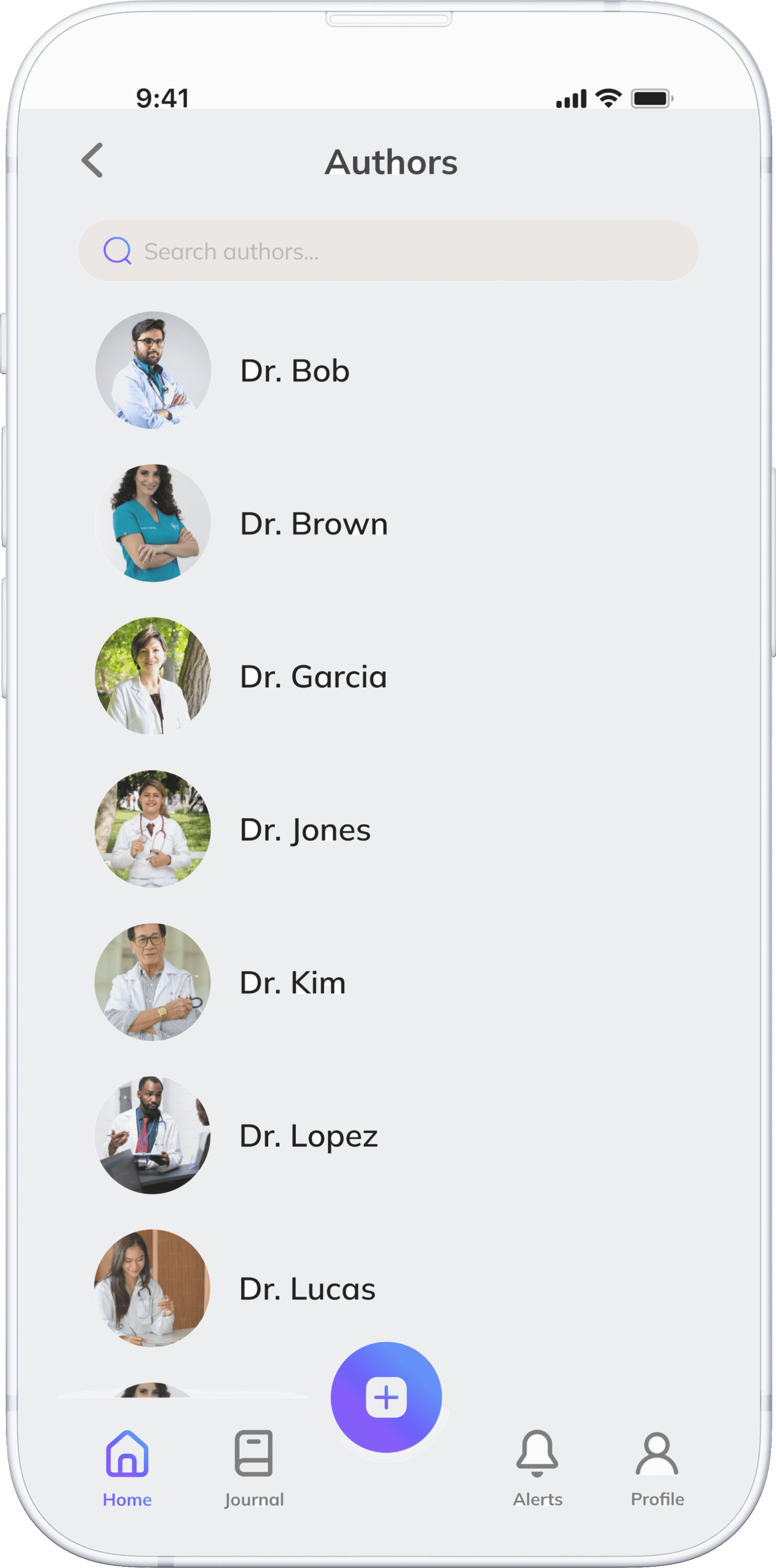
Explore a curated library of trustworthy articles, guides, and tools, carefully curated by dementia care professionals to support caregivers with practical and emotional guidance.
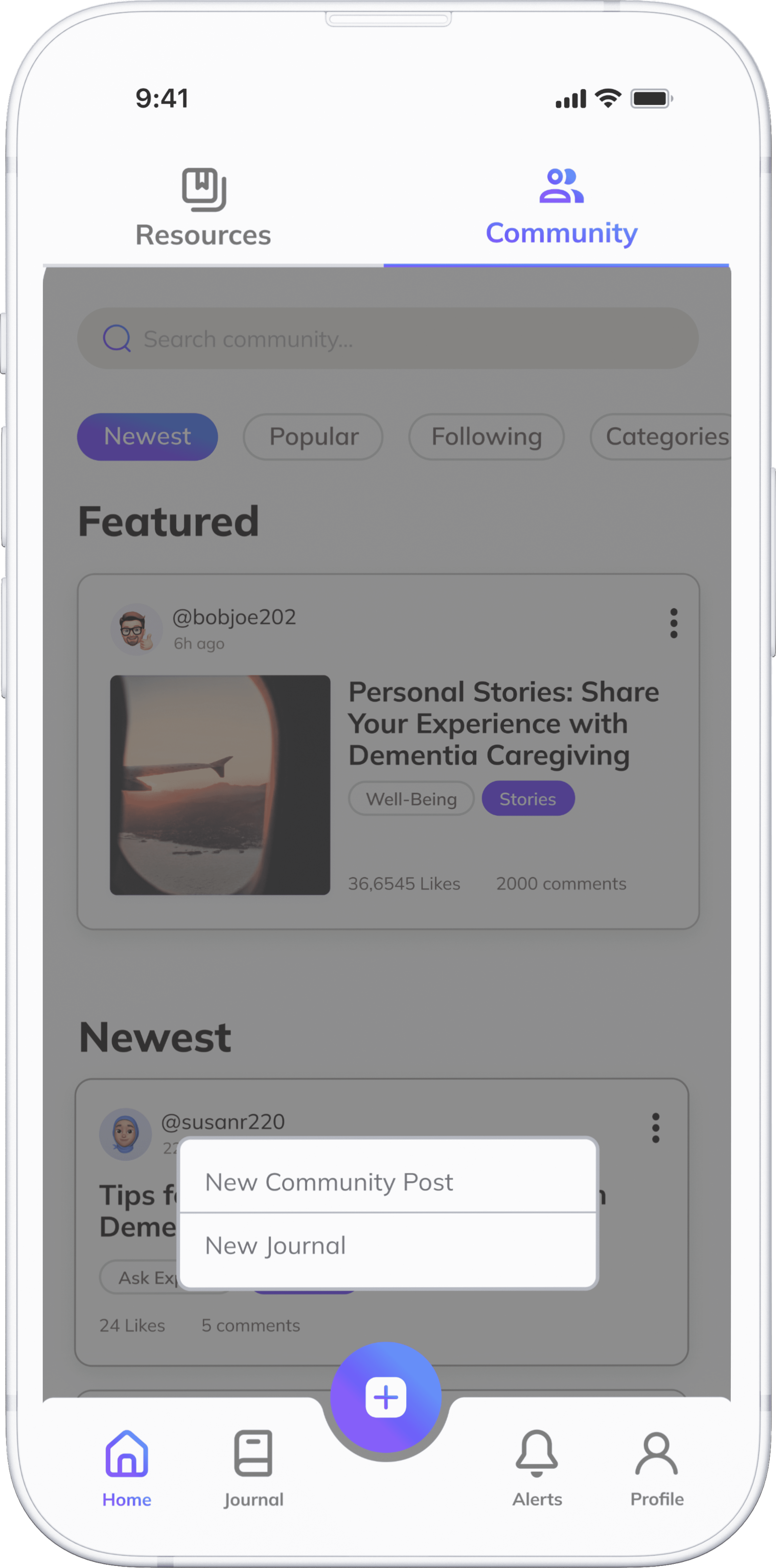
Connect with a caring community of fellow caregivers and professionals who understand your journey. Share experiences, ask questions, and receive empathy, guidance, and encouragement when you need it most.
Process
In the early stages, we realized we were leading with assumptions rather than research. We initially set out to design an app that would connect volunteers with individuals living with dementia. The idea seemed meaningful, but as we began unpacking it, we quickly ran into complications. Questions arose around safety, credibility, and logistics—such as how to vet volunteers, who would host volunteer opportunities, and how to differentiate from existing platforms. Ultimately, we recognized that we were not focusing on the pain pain point suggested in the user journey: difficulty navigating resources. This realization pushed us to pivot and reframe our direction.
Better equipped with user insights, we created an Impact–Effort Matrix to evaluate which features were both viable and essential to prioritize in our app.
Screen Flow
After prioritizing key features with my team, we created a screen flow chart to visualize how users would navigate through the app. This helped us maintain a streamlined flow to ensure we design an app that does not overwhelm caregivers when accessing resources, joining the community forum, or writing in the journal
One of the most significant changes we made from our low-fidelity wireframes was minimizing horizontal and vertical scrolling on the homepage. Originally, each feature (like Resources, Community, and Journal) was squished in one screen and required horizontal scrolling, while the entire page also scrolled vertically. During testing, a user shared that this format felt confusing and overwhelming. This insight led us to redesign the page into a vertically stacked layout while separating each feature into their own page, improving discoverability and flow.
We introduced a top navigation bar with clearly labeled "Resources" and "Community" tabs. This helped distinguish between two very different content types:
Resources: Expert-curated articles from medical professionals and dementia specialists
Community: A forum-style space where caregivers can post personal experiences, ask questions, and exchange support—similar to Reddit
These changes improved overall clarity, reduced cognitive load, and made navigation more intuitive for users managing emotionally demanding caregiving tasks.
Visuals and Branding
App Icon

Title
Primary Colours
Secondary Colours
Blue
#4E88FA
Purple
#7748FC
Gradients
Memory
Interactive Features
Top Navigation Bar
Bottom Navigation Bar
Resources Filter Tags
Search Filtering
Selection Buttons

Typography
Stylized Font: Mulish
Aa Bb Cc Dd Ee Ff Gg Hh Ii Jj Kk Ll Mm Nn
Oo Pp Qq Rr Ss Tt Uu Vv Ww Xx Yy Zz
What I Learned
Designing for Caregivers Means Prioritizing Clarity and Support 💡
Designing for caregivers taught me the importance of emotional sensitivity, accessible interfaces, and providing clear, trustworthy resources.
Pivoting with Purpose 🔄
We initially explored a volunteer-based app, but quickly realized it wasn’t feasible. Learning to pivot based on user needs and constraints helped us shift toward a more focused, realistic, and impactful solution.
Research-Driven Design is Essential 📚
Grounding our design choices in real-world research made the design more relevant and meaningful. From identifying user pain points to understanding demographic trends, this experience reinforced that great design starts with listening and not assumptions.
Limited User Testing with Target Audience 👥
We weren’t able to test the app with real caregivers or older adults due to time and access constraints. All usability testing was conducted within the classroom, which limited our ability to understand how the product would perform in real caregiving contexts.
Lack of Accessibility Validation 🧩
Although accessibility was a design goal, we didn’t fully test our interface with users who have visual impairments or cognitive load sensitivities. Features like contrast, type scaling, and assistive tech compatibility remain unvalidated.
Limited Emotional Feedback 💬
While we focused on usability, we didn’t gather deeper emotional or psychological feedback about how the app made users feel, something that’s especially important when designing for high-stress contexts like caregiving.
Designing with Accessibility in Mind 🎨
While our goal was to create a calm and supportive interface, we overlooked some key accessibility factors, including avoiding the use of pure white backgrounds, which can cause eye strain and reduce readability.
Paying Attention to Spacing and Layout 📏
Some screens felt visually crowded or uneven, which affected readability and navigation. I learned how important consistent spacing, alignment, and hierarchy are in creating a clear and intuitive experience.
Iterate with Real Feedback ⏳
With more time, I would have tested our interface with caregivers directly, particularly older adults or those with accessibility needs, to validate if our calming design truly supported usability in real-world contexts.
9. Acknowledgements
A heartfelt thank you to my teammates Angela and Isabel 💜💜. Working with you made this project feel like a breeze, even when making many design changes and pivots in the design process. I’m grateful for how easy it was to communicate, adapt, and create something meaningful together!
Check out my other work!
TechStyle 2024
Designing for UBC BizTech's first conference celebrating the major breakthroughs in the fashion industry.


